| Table of Contents |
|---|
Historian
The Historian app allows the users to create and manage charts of selected points trends.
Using Historian
To use the Historian, just select the Historian app on the menu.
When the Historian app is selected:
...
Location
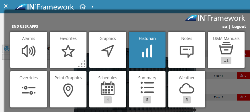
1. Select the App Launcher icon on the top left
2. Select the Historian App under End User Apps
3. The Historian app will switch the right side to the Mini app
Note
...
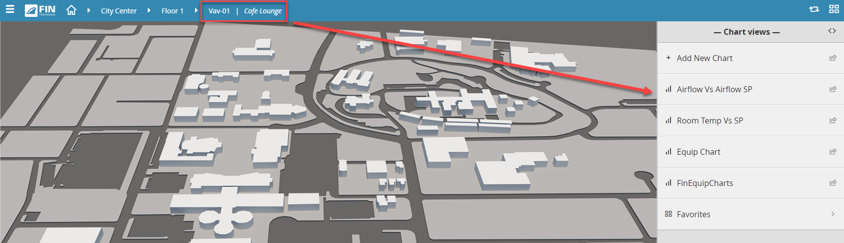
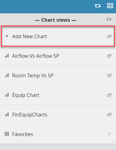
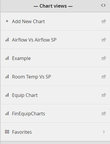
The Historian charts are based on the context of where the user is in the navigation level along with an Add New Chart button
...
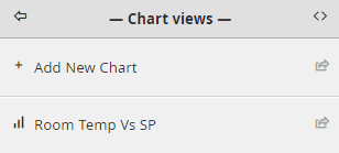
Add New Chart
...
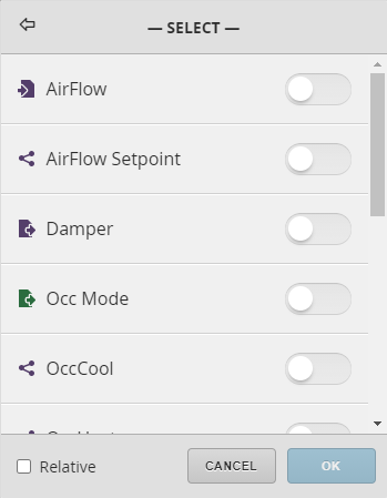
1. Select the Add New Chart option
2. A prompt called Select will open, choose the points for which trends will be displayed
...
...
Note
...
If
...
building a chart on an equip that has other equips of the same type, (like a ReheatVAV),
...
select the
...
Relative
...
checkbox on the bottom left.
...
The saved chart will appear in the Historian on every equip of that same type.
...
5. After the points are selected pressing the OK button will conclude the process and the trends will be displayed.
...
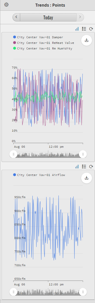
Chart elements
...
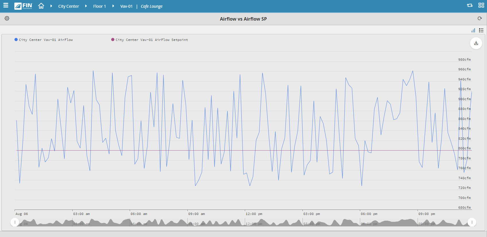
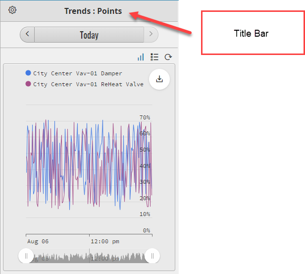
Title Bar
This is where the title is displayed. Left of the title is the options button.
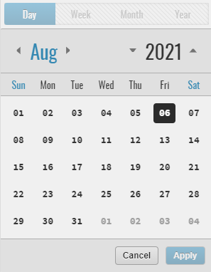
Time range
This is where the time range for which the trends are displayed.
Clicking on the side buttons will display trends by one increment (day, week, month, year) back or forth.
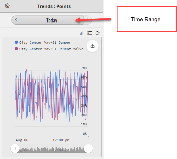
The time range can be customized by clicking the middle button and choosing a suitable time interval.
...
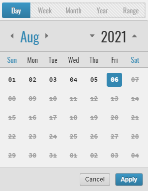
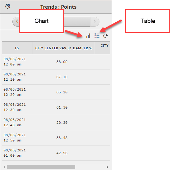
Table and chart view
...
The trends can be displayed in either a chart or table, the selected option will be highlighted as shown below
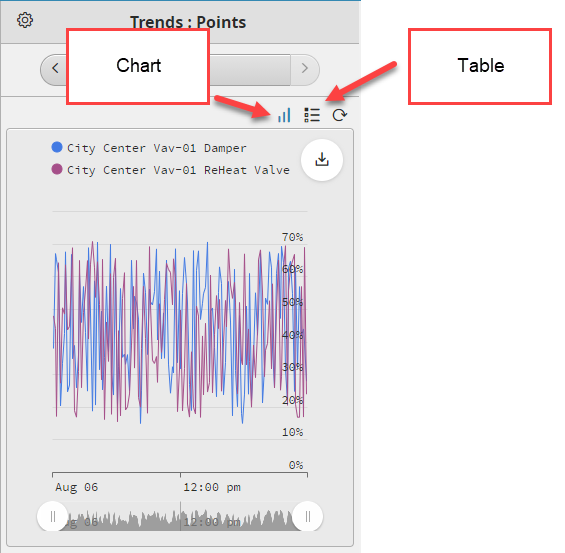
Note
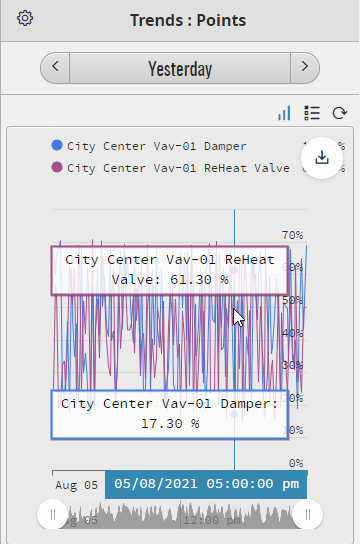
Hovering the mouse over the chart will display the corresponding values
...
...
Trends
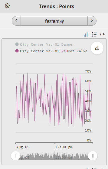
Clicking on a trend name will toggle whether the trend is displayed or not. This is useful for analyzing individual trends on charts with multiple progressions.
| Info |
|---|
Info The trends that are not displayed will have the name greyed out. |
...
Download button
...
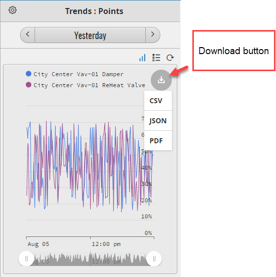
The download button located on the right
...
of the chart, allows the trends to be saved as CSV, JSON, or PDF
...
format
...
Bottom Slider
...
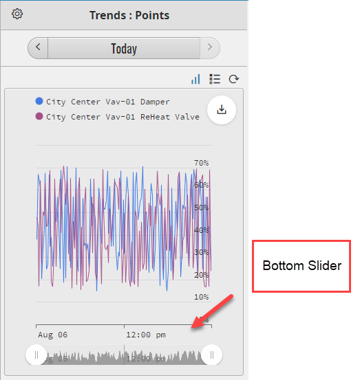
The Bottom Slider allows the user to focus on segments of the chart.
...
Settings Menu
...
1. Click on the Setting gear icon to draw out the
...
Setting menu
...
...
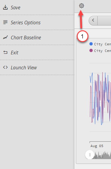
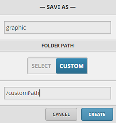
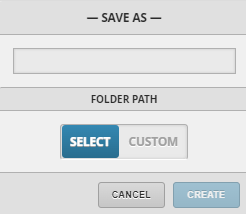
Save
...
Launches the Save As a form, allowing the user to choose a name for the chart and select either the default or a custom folder path for it.
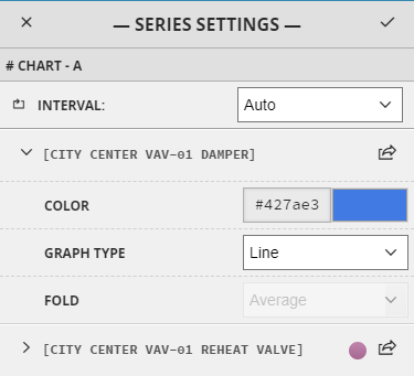
Series Options
This launches the series settings menu in the main window, allowing trends customization.
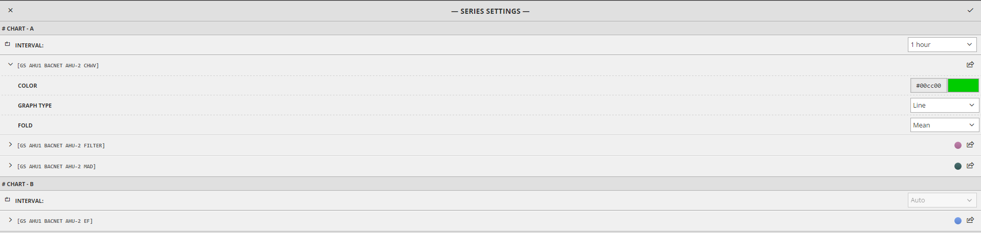
In this menu the user can modify the following:
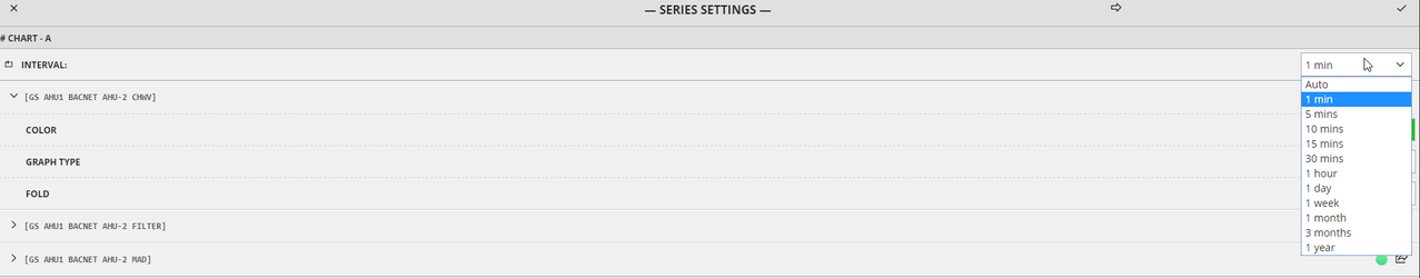
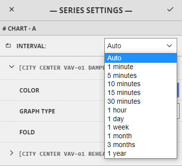
Interval
From the right side dropdown menu, a user can choose a suitable interval for the chart.
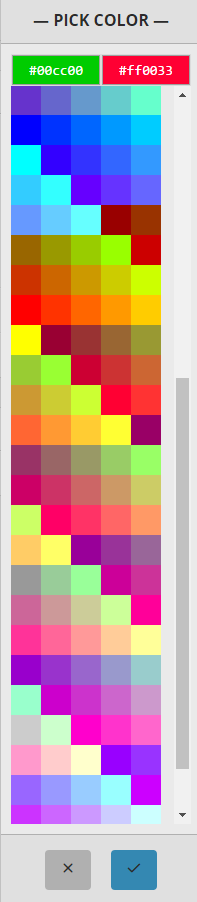
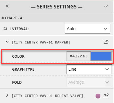
Color
Here, the user can change the color, either by writing the hex-code or by choosing from the palette. To choose from the palette the user needs to click the color and it will be launched in a dropdown
Type
...
The Save option allows the users to save the chart with the current configurations. This will allow them to reopen them as they were saved.
Fields:
The user would enter the name of the chart to be saved in the top field.
Under Folder Path, the user can either select nothing, or select any existing Folder Paths that might have been created, or create a new custom Folder Path. A folder path is a way for the user to organize and categorize the charts. All the charts in a folder path will be nested together in a folder.
Selecting nothing will display the chart and not nest it under a folder.
Selecting an existing folder path will nest the current chart into that selected folder.
To create a new Folder Path, toggle to Custom and enter a name. Next time a new chart is created, the newly created folder path will appear as an option to save the new chart under.
Example of existing Folder Paths:
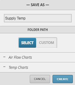
Example of how Folder Paths appear in the app. They will have a grid icon on the left, the name and an arrow of the right side indicating nested charts.
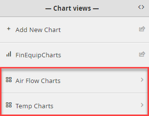
Inside the Folder Path, you’ll find the available nested chart(s).
Series Options
The Series Settings menu allows to customize trends to the user’s preference.
Interval
Choose a suitable interval for the charts to rollup the data. Rollups are inclusive of start and exclusive of end times. For example a daily rollup includes midnight of the current day, but excludes midnight of the next day. All the items found within the interval are passed to the folding function to compute a timestamp/val pair with each timestamp aligned to the start of the interval.
For example a rollup interval of 1day over a one year range would calculate 365 (or 366 if leap year) items with the start time being midnight of each day. Interval rules:
Less 1day: use absolute time, aligned off start (example 1hr)
1day: daily rollup, aligned off midnight
1wk: weekly rollup, aligned off midnight on Sunday
1mo: monthly rollup, aligned off midnight on 1st of month
3mo: quarterly rollup, aligned off midnight on 1st of 3 month intervals
1yr: yearly rollup, aligned off midnight Jan 1st
Color
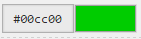
Change the color either by hex-code or selecting from the palette.
To choose from the palette, click on the color and choose a color from the preselected list
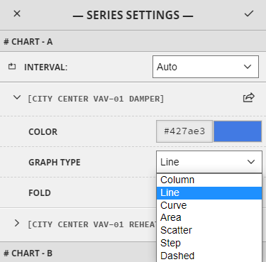
Graph Type
Choose how the trend is displayed, the options are available in the dropdown menu.
...
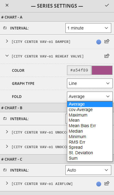
Fold
...
Can select a fold function for each trend.
...
Move to chart
...
1. Click on the arrow button next to the point name, this will open the
...
Move to
...
Chart sidebar.
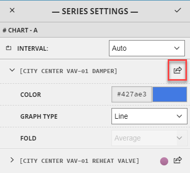
2. The Move to Chart allows to merge similar charts, or move a trend to a separate chart.
...
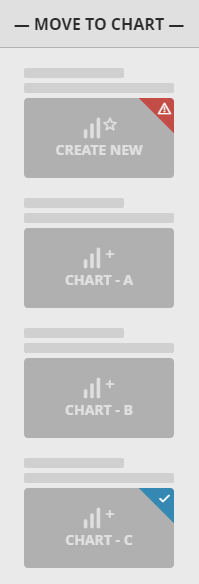
Blue corner
...
...
...
...
3. Clicking the confirmation button will complete the process.
To save the changes under Series Options, click the confirmation button in the upper right corner of the main window.
Chart Baseline
This allows setting a baseline for the chart.
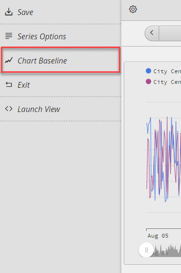
Clicking the option will launch the form where a user can set a baseline for the chart

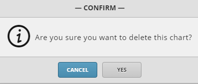
Delete Chart
Launches the prompt to delete the current chart.
Exit
Will exit from the chart view. This will
...
return to the chart selection available on that level.
Launch View
Will display the chart in the main window. The same options from the side view will be available. This allows a better look at the trends.
...