To download please visit
https://stackhub.org/package/finAmChartComponents
Then after installing, make sure to go to Settings App > Ext and enable the extension. (Compatible with v4.5.851+)

This pod will add the AM Chart Category to the components menu. Each chart holds a different number of points and different types of data.
- Area Chart (up to 10 points) - shows his
- Column Chart (up to 10 points) - shows his or curVal
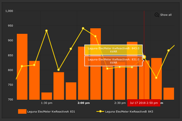
- Column Layered (must be 2 points) - shows his
- Column Line (must be 2 points) - shows his
- Column Stacked (up to 10 points) - shows his
- Line Chart (up to 10 points) - shows his
- Pie Chart (up to 10 points) - shows curVal
How to Use


- Drag out one of the models from the AM Charts Category
- Right click on the model → Tools → Configure Dashboard Component
- This pop-up form is where the AM Chart is configured
- Note the points shown in the dropdown are the virtual points on the page
- If a point is not shown as an option on the dropdown menu, the user may need to drag it out from the equipments menu
Configure Dashboard Component
Area Chart
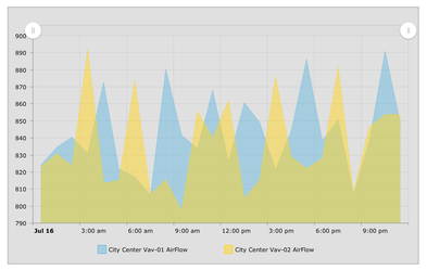

Up to 10 points - Shows his
| Theme | Dropdown - light or dark theme |
| Chart Type | Historical - Show his of points |
| Number of Points | Number of points displayed on Chart (must be 1-10) |
| Timer | If a timer is dragged out can be linked to update chart |
| Legend | If checked will show a legend under the chart |
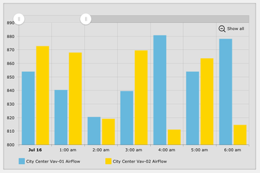
| Chart Cursor | If checked will show a cursor when mouse over the area, can zoom by clicking and dragging over a section |
| Chart Scrollbar | If checked will display a scrollbar at the top, can zoom by resizing the scrollbar |
| Main Title | Title shown at top of chart, if left blank will not display a title |
| Side Title | Title shown on side of chart, if left blank will not display a title |
| Show Background | If checked will show a view-container around the chart |
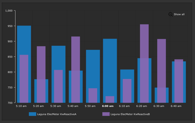
Column Chart
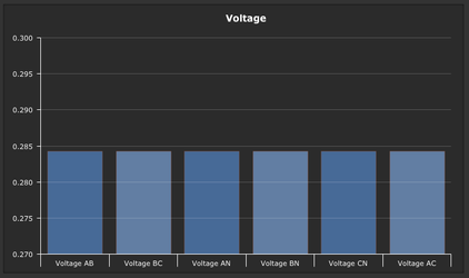
Up to 10 points - Shows his or curVal
| Theme | Dropdown - light or dark theme |
| Chart Type | Dropdown - Historical or CurVal |
| Number of Points | Number of points displayed on Chart (must be 1-10) |
| Timer | If a timer is dragged out can be linked to update chart |
| Main Title | Title shown at top of chart, if left blank will not display a title |
| Side Title | Title shown on side of chart, if left blank will not display a title |
| Rotate | If checked will display bars horizontally |
| Show Background | If checked will show a view-container around the chart |
Column Layered

Must be 2 points - Shows his
| Theme | Dropdown - light or dark theme |
| Chart Type | Historical - Show his of points |
| Number of Points | Number of points displayed on Chart (must be 2) |
| Timer | If a timer is dragged out can be linked to update chart |
| Chart Cursor | If checked will show a cursor when mouse over the area, can zoom by clicking and dragging over a section |
| Legend | If checked will show a legend under the chart |
| Chart Scrollbar | If checked will display a scrollbar at the top, can zoom by resizing the scrollbar |
| Main Title | Title shown at top of chart, if left blank will not display a title |
| Side Title | Title shown on side of chart, if left blank will not display a title |
| Rotate | Dropdown - Vertical or Horizontal |
| 3D | If checked will display chart 3D |
| Show Background | If checked will show a view-container around the chart |
Column Line
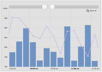
Must be 2 points - Shows his
| Theme | Dropdown - light or dark theme |
| Chart Type | Historical - Show his of points |
| Number of Points | Number of points displayed on Chart (must be 2) |
| Timer | If a timer is dragged out can be linked to update chart |
| Chart Cursor | If checked will show a cursor when mouse over the area, can zoom by clicking and dragging over a section |
| Legend | If checked will show a legend under the chart |
| Chart Scrollbar | If checked will display a scrollbar at the top, can zoom by resizing the scrollbar |
| Main Title | Title shown at top of chart, if left blank will not display a title |
| Side Title | Title shown on side of chart, if left blank will not display a title |
| Show Background | If checked will show a view-container around the chart |
Column Stacked
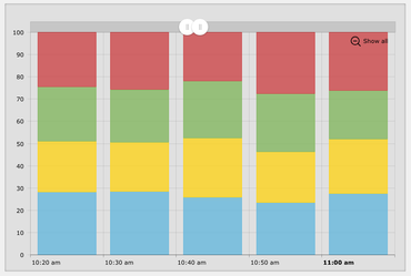
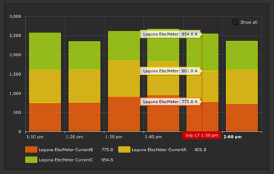
Up to 10 points - Shows his
| Theme | Dropdown - light or dark theme |
| Chart Type | Historical - Show his of points |
| Number of Points | Number of points displayed on Chart (must be 1-10) |
| Timer | If a timer is dragged out can be linked to update chart |
| Legend | If checked will show a legend under the chart |
| Chart Cursor | If checked will show a cursor when mouse over the area, can zoom by clicking and dragging over a section |
| Chart Scrollbar | If checked will display a scrollbar at the top, can zoom by resizing the scrollbar |
| Main Title | Title shown at top of chart, if left blank will not display a title |
| Side Title | Title shown on side of chart, if left blank will not display a title |
| Stacked | Dropdown - Regular or 100% |
| 3D | If checked will display chart 3D |
| Show Background | If checked will show a view-container around the chart |
Line Chart
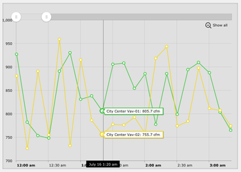
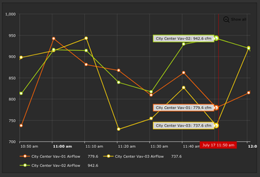
Up to 10 points - Shows his
| Theme | Dropdown - light or dark theme |
| Chart Type | Historical - Show his of points |
| Number of Points | Number of points displayed on Chart (must be 1-10) |
| Timer | If a timer is dragged out can be linked to update chart |
| Legend | If checked will show a legend under the chart |
| Chart Cursor | If checked will show a cursor when mouse over the area, can zoom by clicking and dragging over a section |
| Chart Scrollbar | If checked will display a scrollbar at the top, can zoom by resizing the scrollbar |
| Main Title | Title shown at top of chart, if left blank will not display a title |
| Side Title | Title shown on side of chart, if left blank will not display a title |
| Show Background | If checked will show a view-container around the chart |
Pie Chart
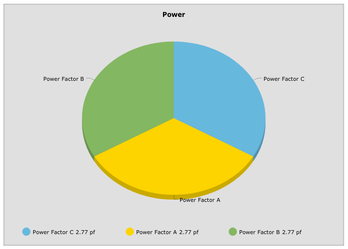
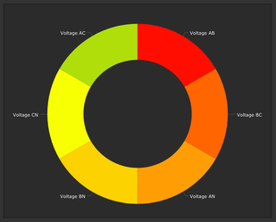
Up to 10 points - Shows curVal
| Theme | Dropdown - light or dark theme |
| Chart Type | CurVal - Show curVal of points |
| Number of Points | Number of points displayed on Chart (must be 1-10) |
| Timer | If a timer is dragged out can be linked to update chart |
| Legend | If checked will show a legend under the chart |
| 3D | If checked will display chart 3D |
| Chart Type | Dropdown - Pie Chart or Donut Chart |
| Magic Bubbles | If checked will show magic bubbles when a slice is clicked |
| Main Title | Title shown at top of chart, if left blank will not display a title |
| Show Background | If checked will show a view-container around the chart |
Configure Dashboard Component History

If the Chart Type is Historical it will display this page to set up the query.
Here the user can choose:
- Use Single Date
- Use Date Range
- Use Date Function
- Use Relative Span
- Rollup Function
Configure Dashboard Component Points

The dropdown contains all the virtual points on the graphic. If a point is desired that is not in the dropdown, it may need to be dragged out from the equipments menu. Under each point is the option to choose the color for that point. Colors can be entered as the color name, RGB, or hex color code (ex. red, rgb(255,0,0), or #ff0000). If no color is entered, will have the default light theme/dark theme colors.