| Table of Contents |
|---|
Below is documentation for css classes that are used in the Graphics Builder. They don't change in the graphics builder. You have to save and view them in the graphics app.
...
| Tag | Description | Light Theme | Dark Theme |
|---|---|---|---|
| valueOnly | A tag that can be added to any Smart Label model to display only the value portion. If it has actions, a gear icon will appear next to the value on the left side. Builder Right-Click Menu#ClickMenu-AddValueOnly |
| |
| sensorPoint | Add the sensorPoint string tag on the superman, and it will change the display value to be of the sensor point choosen. For example, let's say you have superman that is connected to the Fan Cmd and you add a tag to it called sensorPoint:"@idOfSensorPoint", now the display value of the superman will be of the Fan Status instead of the Fan Cmd. (v2317+) Builder Right-Click Menu#ClickMenu-SetSensorPoint | ||
| commandPoint | Add the commandPoint string tag to the superman, and it will change the action that is called by the gear. For example let's say you have a superman that is connected to the Fan Status, and you add a tag to it called commandPoint:"Fan Cmd" , now the gear/action will command the Fan Cmd instead of the Fan Status.(v2315+) Builder Right-Click Menu#ClickMenu-SetCommandPoint | ||
| disableActions | Add this tag to disable the actions on a Smart Label that you don't want commanded through the graphic even though its supposed to have actions. (v2207+) Builder Right-Click Menu#ClickMenu-AddDisableActions | ||
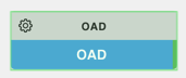
| nameTagName | nameTagName allows for you to change the smart label's display to show the selected tag proper format: nameTagName:"description" or nameTagName:"curVal" Short name trumps this property tag | ||
| valueTagName | valueTagName allows you to change the smart label's value display to show the selected tag. By default, the value portion of the superman shows curVal. The value can be changed to display any other tags value thats available on its virtualPointBinding. 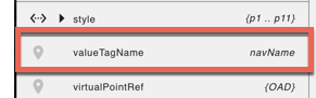 Example: valueTagName:"navName" or valueTagName:"description" |
| |
| statusBGColors | The statusBGColor logic basically allows System Integrators to add a string tag to a "Smart Label" component which will then allow the color of the value portion to be customized based on a designated point and value. Status BG Colors (tool) |
| |
| size-set | This resizes the smartLabel when combined with either small, medium, or large classes. |
|
...
| Class | Description | Light Theme | Dark Theme |
|---|---|---|---|
| view-container | can be applied to any component and gives them a container type view |  |  |
| disabled | can be applied to anything, this will make the component disabled |  |  |
Icon Classes
For a list of icon classes, open Graphics Builder and in the right menu select File Assets → List of Icons. (basically its going to ip:port/pod/finStackMobileExt/icons.html).
Adding Custom CSS
This is now documented here: Adding CSS to Graphic.