Status BG Colors
- Ricky Villa
- Kimberly Cruz (Unlicensed)
Status BG Colors
We have made the Status BG Colors tool to make it easier for the user to apply their own custom colors to smartLabels based on the curVal or custom tag. The user will need to know the hex color codes (ie. - #ff0000) depending on the color(s) they want.
There are various websites to get these codes, below are a few:
- http://www.color-hex.com/
- https://htmlcolorcodes.com/color-picker/
- https://www.w3schools.com/colors/colors_picker.asp
How to use Status BG Colors
The user would first open their graphic in Graphics Builder. Select a smartLabel and right click on it to navigate to Style > Status BG Colors.
Note: Multiple smartLabels of the same type of point can be selected to apply same statusBGColors configuration. If different point types of smartLabels were selected, it will only apply to one point type. The user would then have to select the other type afterwards to configure them as well.
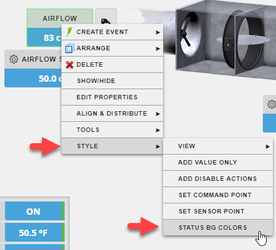
Depending on the selected, you'll get one of the below for the tag types. By default it looks at curVal of point types and sets the kind to be that.

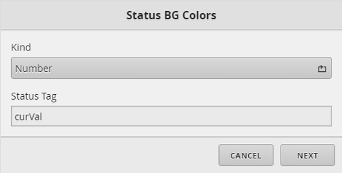

Here the user can choose the tag they want to base the color(s) off of. Make sure to change the kind depending on the type of tag it is.
Once selected, the user will select "Next" to get the one of the below types of popups depending on tag type (Boolean, Number, Enum/String). We will cover one type at a time.
Boolean Type Tag Configuration
If the user selected a boolean type tag, then they'll get the below pop up.
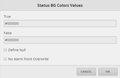
The below fields are available:
- True - select color if value is 'true'. If user doesn't want to assign a color for this property, remove current color text and it won't assign anything to it (it will be removed as an option once the others are applied). It would default to the theme color.
- False - select color if value is 'false'. If user doesn't want to assign a color for this property, remove current color text and it won't assign anything to it (it will be removed as an option once the others are applied). It would default to the theme color.
- Define Null - if user selects this option, they will be prompted to select a color if the value is null. If not configured, it would default to theme color. Look at "Defining Null/Out of Range Configuration" section below for more.
- No Alarm Point Overwrite - This option is intended only for boolean points that are tagged as 'alarmPoint' and status tag specified is curVal. What it does if enabled is not allow our default alarmPoint logic overwrite custom colors on particular boolean point if the user wishes to use other custom colors. Look at "Alarm Points - Boolean (Auto)" section below to see how that works. This would be rare to use, but its available if needed/wanted.
Thats it, once configured, its good to go.
Note: If the user needs to re-modify current configurations, then would open up the tool again. It would display the previous color configurations. However, if the user did not assign a color for either true or false, the tool will re-add that property (default color it adds is #000000 - black). The user would have to remember to remove it again if not wanted for that value.
Number Type Tag Configuration
If the user selected a number type tag, then they'll get the below pop up where they can determine how many color values they want to apply.
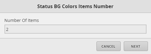
Once number of items are selected, they will be prompted with something like below.
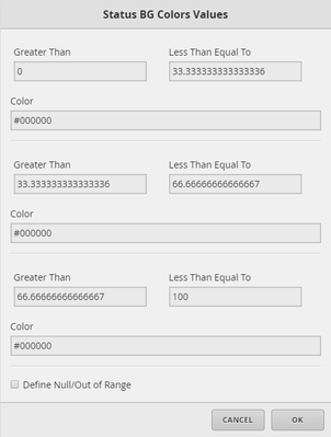
The below fields are available:
- Greater Than OR Less Than Equal To (x however many chosen) - the user can select the range of value for color. For a specific whole number value, make both fields the same. For example if you want 0 to be a different color, set "Greater Than" and "Less Than Equal To" both to 0. If user doesn't want to assign a color for a property, remove either current color text or Greater Than or Less Than Equal To fields and it won't assign anything to it (it will be removed as an option once the others are applied). It would default to the theme color if value is not specified by any of the other properties.
- Color (x however many chosen) - the user selects the color for the corresponding property above.
- Define Null/Out of Range - if user selects this option, they will be prompted to select a color if the value is null/out of range/nan. If not configured, it would default to theme color. Look at "Defining Null/Out of Range Configuration" section below for more.
Thats it, once configured, its good to go.
Note: If the user needs to re-modify current configurations, then they would open up the tool again. Upon opening, it would ignore the number items IF number is set to less than previous configuration count. It would display however many current values have been configured the previous time. If the number items is more than what was configured before, it would add those additional properties to be configured as well. Basically to change current configuration amount or to remove, ignore the number items. To add more properties, then you'll want to make sure you set the number items greater than how many are currently configured.
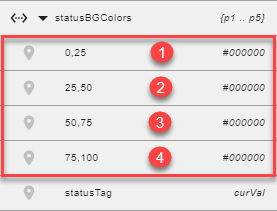
Tip: To find out how many properties have been configured, select the smartLabel and open the Properties panel. Toggle to the Advanced properties and expand the statusBGColors.
You can see below we have 4 properties configured. Ignore statusTag and null properties.
Enum/String Type Tag Configuration
If the user selected a enum/string type tag, then they'll get the below pop up where they can determine how many color values they want to apply for enum states.
Note: By default, the tool will ignore the number items when applying this property the first time. What it does is return each enum value for the user so that they don't have to type each one. Then from there, the user can remove the ones they don't want if needed. If they removed lets say half of the enum values because they didn't want to assign them at first, then they can re-run through the wizard again to add more if they need to. Thats when the number items will take into account how many are currently configured plus how many more you want to add.
For example, an enum point has 5 enum values. You remove 3. So you have 2 enum values configured for statusBGColors. Later you decide you want to add a 3rd enum value to the configuration. Re-running through the wizard, you would pick 3 number items (2 currently configured + 1 extra to configure).

Once number of items are selected, they will be prompted with something like below.
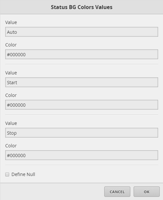
The below fields are available:
- Value (x however many enum values) - this will be the value of the enum. It is case sensitive so make sure its the correct enum value if changing it. Confirm/copy it from DB Builder point properties. If user doesn't want to assign a color for a property, remove either current color text or Value fields and it won't assign anything to it (it will be removed as an option once the others are applied). It would default to the theme color if value is not specified by any of the other properties.
- Color (x however many enum values) - the user selects the color for the corresponding value property above.
- Define Null - if user selects this option, they will be prompted to select a color if the value is null. If not configured, it would default to theme color. Look at "Defining Null/Out of Range Configuration" section below for more.
Thats it, once configured, its good to go.
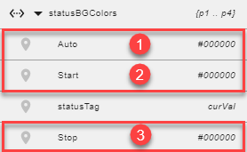
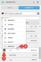
Tip: To find out how many properties have been configured, select the smartLabel and open the Properties panel. Toggle to the Advanced properties and expand the statusBGColors.
You can see below we have 3 properties configured. Ignore statusTag and null properties.
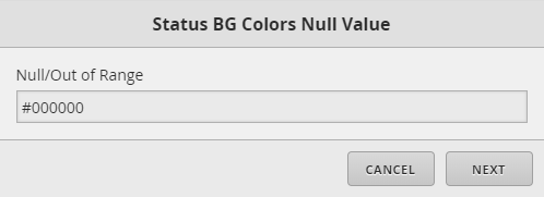
Defining Null/Out of Range Configuration
If the user has selected to Define Null/Out of Range option, they would get the below pop up where they can choose the color they would want if the value is ever null/out of range. If not configured, it would default to theme color.
If the user chose this option and later decided they no longer want it, they can either uncheck the box when going through the wizard again or remove it from the property itself. Look at "Removing Properties Manually" section below on how to remove it without the wizard.
Removing Properties
If the user would like to remove configurations, they can do so when running through the Status BG Colors tool or Properties panel manually.
Removing configurations through the wizard, either remove the value and/or color properties for that specify property. It will then be removed (not assigned) when applying the other properties.
To remove the whole statusBGColors property manually, select the (↔) next to the statusBGColors property and then select Remove. Another way would be to use the Apply Batch Tags tool.
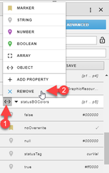
To remove just a property under statusBGColor, select icon next to the property and then select remove. This would have to be done manually to each smartLabel. Best to use the wizard if there are a lot of them that need a property removed.
Alarm Points - Boolean (Auto)
If the boolean point in DB Builder or in VirtualPoints (Graphic Builder) is tagged as "alarmPoint", then all you need to do is tag the smartLabel as "statusBGColors" marker tag. No need to use the tool since its a simple tag.
This will make the value color be red if true and normal if false by default.
To reverse the color logic, add "reverseAlarm" marker tag on the point in DB Builder.
This would make it dynamic on relative graphics where some points might be true=alarm and some false=alarm.
(NOTE: If "reverseAlarm" marker tag exists on the virtualPoint in Graphics Builder, remove it because it'll be like hardcoding it which we don't want)
Applying Manual Way
If the user has an older version or would like to know how to manually apply these, the way to apply them manually is doc'd here Status BG Colors - Manual.