GB Classes
- Ricky Villa
- Koppany Horvath (Unlicensed)
- Michael Whalen (Unlicensed)
Below is documentation for css classes that are used in the Graphics Builder. They don't change in the graphics builder. You have to save and view them in the graphics app.
Classes for Buttons
| Class | Description | Light Theme | Dark Theme |
|---|---|---|---|
| view-default | is the default button |  |  |
| view-default focus | is the blue/focused button |  |  |
| view-default success | is the green/success button |  |  |
| view-default error | is the red/error/alert button |  |
|
| view-light-text | Text color that is a light color, meant for putting on a dark background | ||
| view-light-dark | Text Color that is a dark color, meant for putting on a light background | ||
| view-theme-text | This is the color of text that will be based on the theme | ||
| view-header-text |

Tags for Smart Label Component
| Tag | Description | Light Theme | Dark Theme |
|---|---|---|---|
| valueOnly | A tag that can be added to any Smart Label model to display only the value portion. If it has actions, a gear icon will appear next to the value on the left side. Builder Right-Click Menu#ClickMenu-AddValueOnly |
| |
| sensorPoint | Add the sensorPoint string tag on the superman, and it will change the display value to be of the sensor point choosen. For example, let's say you have superman that is connected to the Fan Cmd and you add a tag to it called sensorPoint:"@idOfSensorPoint", now the display value of the superman will be of the Fan Status instead of the Fan Cmd. (v2317+) Builder Right-Click Menu#ClickMenu-SetSensorPoint | ||
| commandPoint | Add the commandPoint string tag to the superman, and it will change the action that is called by the gear. For example let's say you have a superman that is connected to the Fan Status, and you add a tag to it called commandPoint:"Fan Cmd" , now the gear/action will command the Fan Cmd instead of the Fan Status.(v2315+) Builder Right-Click Menu#ClickMenu-SetCommandPoint | ||
| disableActions | Add this tag to disable the actions on a Smart Label that you don't want commanded through the graphic even though its supposed to have actions. (v2207+) Builder Right-Click Menu#ClickMenu-AddDisableActions | ||
| nameTagName | nameTagName allows for you to change the smart label's display to show the selected tag proper format: nameTagName:"description" or nameTagName:"curVal" Short name trumps this property tag | ||
| valueTagName | valueTagName allows you to change the smart label's value display to show the selected tag. By default, the value portion of the superman shows curVal. The value can be changed to display any other tags value thats available on its virtualPointBinding. 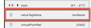 Example: valueTagName:"navName" or valueTagName:"description" |
| |
| statusBGColors | The statusBGColor logic basically allows System Integrators to add a string tag to a "Smart Label" component which will then allow the color of the value portion to be customized based on a designated point and value. Status BG Colors (tool) |
| |
| size-set | This resizes the smartLabel when combined with either small, medium, or large classes. |
|
Classes for Components
| Class | Description |
|---|---|
| mobile-small-hidden | ($bp-mobile-small = 480px) if the screen is between 480px - 767px then the component you add this to will hide |
| mobile-hidden | ($bp-mobile = 767px) if the screen is between 767px - 768px then the component you add this to will hide |
| tablet-hidden | ($bp-tablet = 768px) if the screen is between 768px - 1024px then the component you add this to will hide |
| desktop-hidden | ($bp-desktop = 1024px) if the screen is between 1024px - 1200px then the component you add this to will hide |
| desktop-wide-hidden | ($bp-desktop-wide = 1200px) if the screen is greater than 1200px then the component you add this to will hide |
Classes for Labels
| Class | Description | Light Theme | Dark Theme |
|---|---|---|---|
| view-superman-label | is the label style for any form of label that needs to be emphasized (Normally the property name for the superman component) |  |
|
| view-superman-value | is the label class for the super-man value (default is the blue one) |  | |
| view-superman-value round | is also the value label but with rounded corners (like totally round). MAKE SURE you make the width and height equal so that it is not an oval |  | |
| view-superman-value status-ok | is the value label with the BG of OK status |  | |
| view-superman-value status-overridden | is the value label with the BG of OVERRIDDEN status |  | |
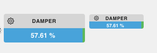
| view-superman-value status-unacked | is the value label with the BG of UNACKED status | 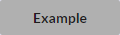 |  |
| view-superman-value status-alarm | is the value label with the BG of ALARM status | 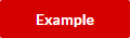 | |
| view-superman-value status-fault | is the value label with the BG of FAULT status |  |  |
| view-superman-value status-stale | is the value label with the BG of STALE status | 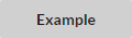 |  |
| view-superman-value status-down | is the value label with the BG of DOWN status |  |  |
| view-superman-value status-disabled | is the value label with the BG of DISABLED status | 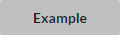 |  |
| view-superman-value status-null | is the value label with the BG of NULL status |  |  |
| view-header-text | |||
| view-light-text | Text color that is a light color, meant for putting on a dark background | ||
| view-light-dark | Text Color that is a dark color, meant for putting on a light background | ||
| view-theme-text | This is the color of text that will be based on the theme | ||
| view-big | this will change the text size of all the "contained" view-superman-value and view-superman-label elements to 16px. If this class exists any child element would have a bigger font size. You can try this by adding view-big to the body, and all view-superman-value items font will change. This also changes the size of the Super Renderer as well | ||
| view-medium | Same as view-big except it will make it a font size of 12px This also changes the size of the Super Renderer as well | ||
| view-small | Same as view-small except it will make it a font size of 10px This also changes the size of the Super Renderer as well | ||
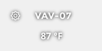
| view-mini non-interactive | This is typically used on floorplans. Top label shows the point's equipRef name, and the bottom label shows the point's value |
| |
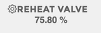
view-mini dark no-shadow | This gives the smart label a stripped down "no theme" look and feel, with solid plain text (dark gray in the light theme, and white in the black theme). This one is recommended for the light theme. |
|
Super Renderer for overview boxes
| Class | Description | Light Theme | Dark Theme |
|---|---|---|---|
| view-wrap-box | Creates a regular container style "System Menu" which allows you to drag and drop in superman components which automatically turn into strips (Minimum Width = 450px) | 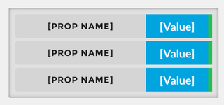 | |
| view-wrap-box view-short-name | This smaller container (system menu) will take on a different style in which the value portion of the strip is larger than the text portion of the strip | 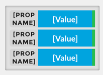 | |
| view-wrap-box small | Creates a potentially smaller container style "System Menu" which allows you to drag and drop in superman components which automatically turn into strips (Minimum Width = 150px) | 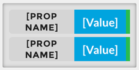 | |
| view-wrap-box view-stacked | Creates a regular container style "System Menu" which allows you to drag and drop in superman components which retains the superman window style and stacks it with the rest of the components within the container (Minimum Width = 450px) | 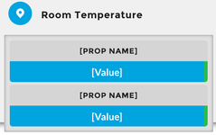 | |
| view-wrap-box small view-stacked | Creates a potentially smaller container style "System Menu" which allows you to drag and drop in superman components which retains the superman window style and stacks it with the rest of the components within the container (Minimum Width = 150px) | 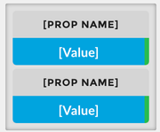 | |
| view-wrap-box view-short-name | This container (system menu) will take on a different style in which the value portion of the strip is larger than the text portion of the strip | 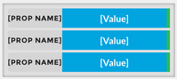 | |
| view-wrap-box view-short-name | This smaller container (system menu) will take on a different style in which the value portion of the strip is larger than the text portion of the strip | | |
| view-super-renderer | This has 4 labels in it, and the labels will automatically change based on this class. You need a program to make this work as well. | 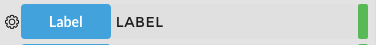 | 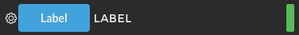 |
Extra Classes
| Class | Description | Light Theme | Dark Theme |
|---|---|---|---|
| view-container | can be applied to any component and gives them a container type view | 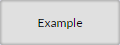 | 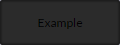 |
| disabled | can be applied to anything, this will make the component disabled |  |  |
Icon Classes
For a list of icon classes, open Graphics Builder and in the right menu select File Assets → List of Icons. (basically its going to ip:port/pod/finStackMobileExt/icons.html).
Adding Custom CSS
This is now documented here: Adding CSS to Graphic.