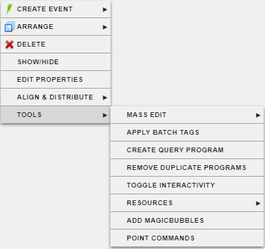
Builder Right-Click Menu
- Christopher Simonian
- Ricky Villa
- Koppany Horvath (Unlicensed)
- Kimberly Cruz (Unlicensed)
Overview
Our graphics builder app features a very helpful right click menu that is dynamically populated based on the object that is right-clicked on.
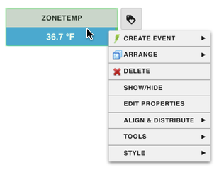
Many of these Right Click menu's contain typical options, quick shortcuts and specialized tools that pertain to the object that was right clicked on.
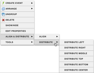
Align & Distribute
General
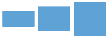
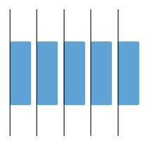
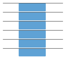
Left Edges
Spaces the Components evenly, starting from the left pixel of each Component.
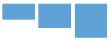
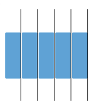
Right Edges
Spaces the Components evenly, starting from the right pixel on each Component.
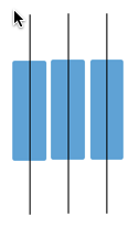
Horizontal Centers
Spaces the Components evenly, starting from the horizontal center of each Component.
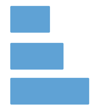
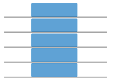
Top Edges
Spaces the Components evenly, starting from the top pixel of each Component.
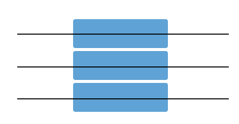
Bottom Edges
Spaces the Components evenly, starting from the bottom pixel of each Component.
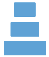
Vertical Centers
Spaces the Components evenly, starting from the vertical center pixel of each Component.
Align
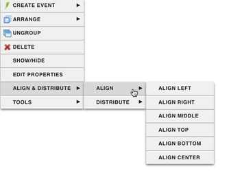
Align Left
Align Right

Align Middle
Align Top
Align Bottom

Align Center
Distribute
Distribute Left
Distribute Right
Distribute Middle
Distribute Top
Distribute Bottom
Distribute Center
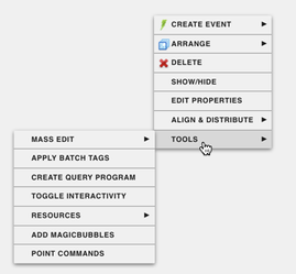
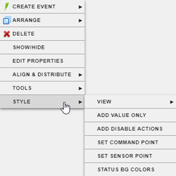
Tools
Remove Duplicate Programs
This tool basically removes duplicate programs. Before, when components linked to programs were duplicated, it also duplicated the programs. It would double based on how many programs there were. What this tool does is removes those duplicates. However, this issue has since been resolved. Its more for older existing graphics that have duplicate programs.
Add MagicBubbles
This tool allows the user to add magic bubbles to components that aren't configured to trigger them. This will display the parent equip bubbles not point bubbles. What it does is adds the "magicBubbles" tag to the component and adds the "Open Related Bubbles" program. Make sure point is bound to object.
Note: If you user is looking for the point bubbles, they can get a program from here under PointBubbles.
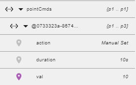
Point Commands
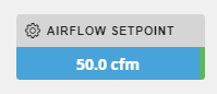
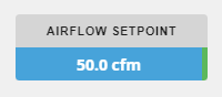
This tool allows the user to configure predefined onClick commands for a point and add them on components like buttons for example. Once the bubbon is clicked, it will command the point chosen, and set the type of action, duration (if applicable), and value.
Example below.
- Drag out button
- Select it and right click
- Navigate to Tools > Point Commands
- Select point you want to command once clicking on button
- Select available action types on that point
- Set value and/or duration (if applicable)
- Thats it, now it can be tried in Preview or Viewer
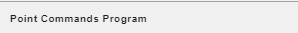
What it does is adds an object property called "pointCmds". It then nests another object property under it as the points graphic builder id that contains the action type, duration (if applicable), and value. It also adds the "Point Commands Program" needed to excute the command.
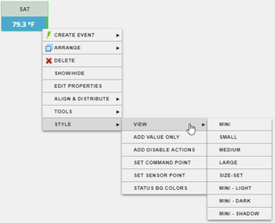
Style
The "View" classes can be added manually by the user in the "Classes" property of that component. That is if the user knows what classes to add for what they are looking for or use our tools.
View > Mini
This will change the smartLabel and make it look like below with white text and shadow. This is what is used on the floorplan graphics by default. What this option does is adds the "view-mini" class to the smartLabel.


View > Small
This will change the smartLabel and make it look like below with smaller font size than standard default. What this option does is adds the "view-small" class to the smartLabel. Its best to use with "size-set" class as well. Look below for that class.


View > Medium
This will change the smartLabel and make it look like below with slightly larger font size than standard default. What this option does is adds the "view-medium" class to the smartLabel. Its best to use with "size-set" class as well. Look below for that class.


View > Large
This will change the smartLabel and make it look like below with larger font size than standard default. What this option does is adds the "view-big" class to the smartLabel. Its best to use with "size-set" class as well. Look below for that class.


View > Size-Set
This alone won't change the smartLabel. It has to be used in conjunction with one of the classes above (small, medium, or large). When combined with one of those classes, it resizes the smartLabel appropriately depending on size chosen.
The user would first pick small, medium, or large option, then select this option so that the classes below are added accordingly.
Small = view-small size-set


Medium = view-medium size-set


Large = view-big size-set


View > Mini - Light
This will change the smartLabel and make it look like below with darker text and no shadow. What this option does is adds the "view-mini light no-shadow" classes to the smartLabel.


View > Mini - Dark
This will change the smartLabel and make it look like below with dark text and no shadow. What this option does is adds the "view-mini dark no-shadow" classes to the smartLabel.


View > Mini - Shadow
This is the same as View > Mini above. What this option does is adds the "view-mini" class to the smartLabel.


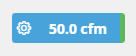
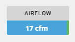
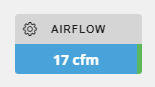
Add Value Only
This will change the smartLabel and make it only display the value portion. If the point has actions, the gear icon will appear on the left side of it. What it does is adds the "valueOnly" marker tag to the smartLabel.

If the tag is added, right clicking to view the Styles again will show up as "Remove Value Only". It will do the opposite. It will make the smartLabel display its name and value again.
Add Disable Actions/Remove Disable Actions
This will hide the actions gear icon on a smartLabel that is bound to a commandable point that the user doesn't want to be commanded at all through the graphic. What it does is adds the "disableActions" marker tag to the smartLabel.
If the tag is added, right clicking to view the Styles again will show up as "Remove Disable Actions". It will do the opposite. It will make the smartLabel display the actions gear icon again.
Set Command Point
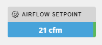
This is typically used on a sensor point. This will allow the user to link a commandable point on a sensor so that only one smartLabel is used. For example let's say you have a smartLabel that is connected to the Fan Status and you want to merge the Fan Cmd actions to it, you'll be able to do this with this option. So now you have a smartLabel the displays the Fan Status value, but also able to command the Fan Cmd with this single smartLabel. What it does is adds a string tag called commandPoint and adds the name of the command point.
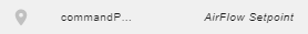
Note: This retains the smartLabels virtualPointRef value and status properties not the commandPoint properties. So if the command point is overridden, it will not turn purple on this smartLabel. IF both points happen to have actions, the commandPoint will trump the virtualPointRefs actions. So you'll get the actions of the commandPoint.
Set Sensor Point
This is typically used on a command point. This will allow the user to link a sensor point on a command so that only one smartLabel is used. For example let's say you have a smartLabel that is connected to the Fan Cmd and you want to merge the Fan Status to it, you'll be able to do this with this option. So now you have a smartLabel the displays the Fan Status value, but also able to command the Fan Cmd with this single smartLabel. What it does is adds a string tag called sensorPoint and adds the graphics builder id of the sensor point.

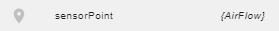
Note: This retains the smartLabels virtualPointRef actions and status properties not the sensorPoint properties. So if the command point is overridden, it will turn purple on this smartLabel. IF both points happen to have actions, the virtualPointRef will trump the sensorPoint actions. So you'll get the actions of the commandable point.
Status BG Colors
This is covered in the Status BG Colors doc.