Custom Header
- Christopher Simonian
- Ricky Villa
- Kimberly Cruz (Unlicensed)
Overview
The custom header is a customizable header that offers Integrators the ability to set up buttons & drop-downs that can hyperlink to graphics, actions, and webpages throughout the software (and externally) for the users to access and utilize.
Video
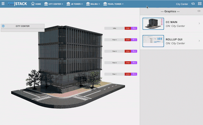
Accessing the Custom Header
This section will walk you through the process of creating your Custom Header
Enable Custom Header
- To enable your custom header, the user will need to select the "switch" icon
 . This is located on the right side of the navigation bar.

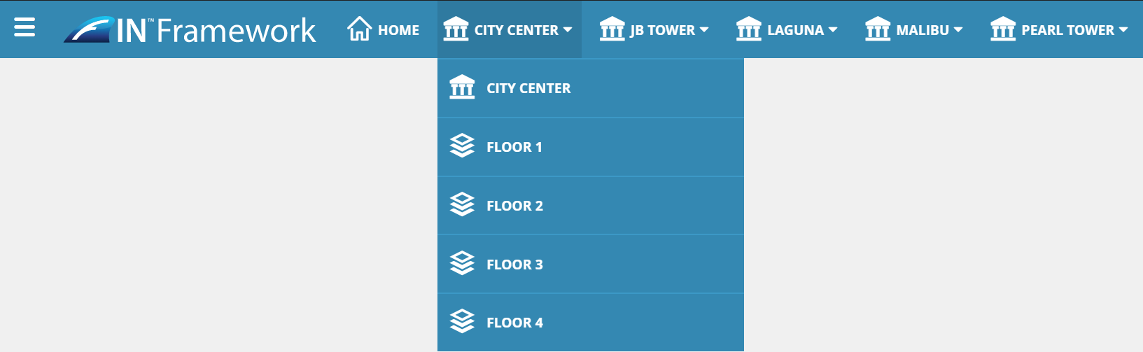
Example: Enabled Toggle - Customer Header

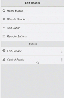
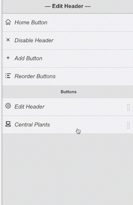
Edit Header
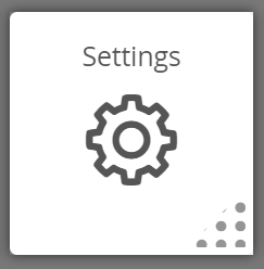
1. To edit your header, the integrator will need to open the App Selection Menu and go down to the "Settings" App
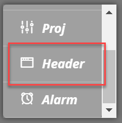
2. When the Settings app is clicked on, scroll down and select the "header" option
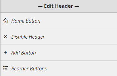
3. Here you can find tools to be able to modify your header.
Header Properties
Once the custom header is enabled, the below properties will become available on the header bar:
Context
Your current context will always appear on the top right of the Custom Header.

Clicking on the context will bring up relative bubbles for that context:
Configuring the Custom Header
This section will guide you on how to configure your custom header's Home & Menu Buttons.
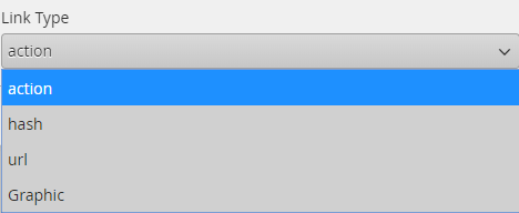
Link Types
Throughout the Configure Header window, you will run across properties that will allow the user to determine what the specified button will do. These properties are as follows:
Actions: This property allows the user to call any JavaScript action. See below for a few examples.
- Example: alert('hello world')
- Description: an alert is a standard javascript function that in this case will bring up an alert saying 'hello world' when clicked on.
- Example: window.open("https://www.youraddress.com","_self")
- Description: calls open a window with any address you'd like. You can use a FIN Stack URL address to open any exact fin stack page.
- Example: finstack.eval('axonFunction(param1,param2)')
- Description: in this case, you can call ANY fin stack form/function to come up. replace red text with function name: axonFunction and the parameters based on what the function requires.
Hash: This option allows you to hyperlink to views within FIN Stack. To utilize the hash, do the following:
- Open separate tab
- Open the graphic/view that you want to hyperlink to
- Copy the URL from the #frame onward to the very end
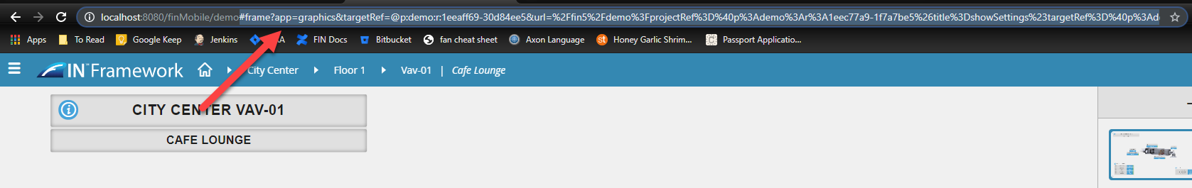
- Paste it into the button's Hash section to create a hyperlink.
- URL: This allows you to enter in any URL to create an external (or internal) hyperlink. This could be the customer website, customer service page, etc. etc
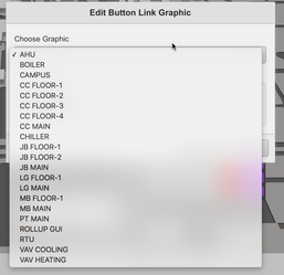
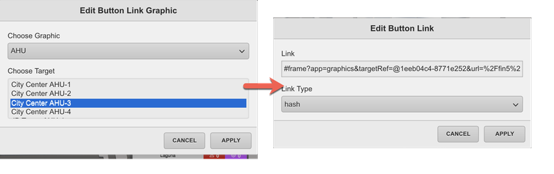
- Graphics: This option allows the user to pick and choose a Graphic & Target Ref from an easy-to-use dropdown menu. Once complete, this will auto-create a "hash" graphic link.
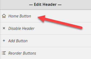
Home Button
The Custom Header comes with a Home button by default.

- To edit the functionality of the Home Button, select on Home Button
- Click on the "Home Button" option to bring up its individual settings
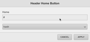
If left as-is: If you leave the default "hash" and #...the home button will automatically default to the Top Level Graphic
Once you are done, hit "Apply" and "Done" to confirm the home button functionality.
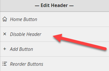
Disable Header
This button allows the integrator to disable the header.
Menu Buttons
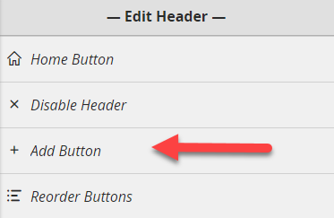
Add Button
If you want to add a menu button:
- Click on the Add Button option, which will automatically create a new button
- It will take you to the "Add Button" menu containing several options for the integrator to customize the newly added button.
**REFRESH the browser page to view your changes
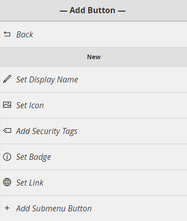
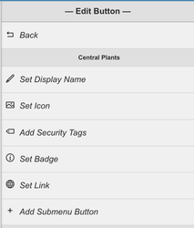
Button Properties
When adding/editing Buttons on the custom header, you will typically see the following properties.
See below for more information on what each property does:
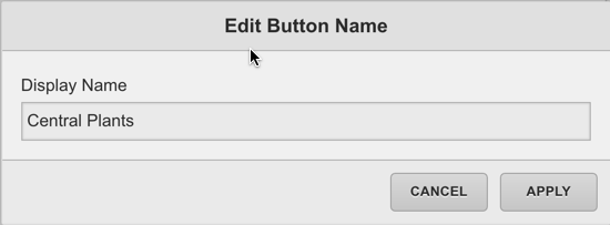
Set Display Name: This will be the name that is displayed on the Menu Button. (not required)
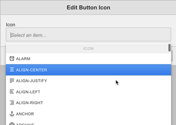
Set Icon: Allows you to select from a list of available icons. The selected Icon will appear next to the Menu Buttons Display Name. A '+' icon will appear by default when a new button is first added.
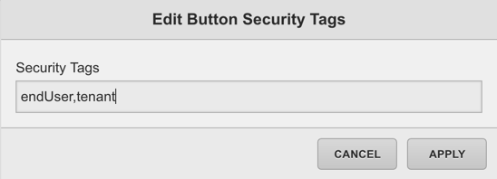
Add Security Tags: Allows you to add a security marker tag to the button which can later be filtered to hide/show the button for particular users. Use a comma to separate multiple tags if needed.
Set Badge: Allows you to set a query filter that will be displayed as a "badge" on the button. The proper query to use for this would be a readCount() or anything similar to that

Badge Query Examples:
- readCount(centralPlant and equip) will bring back the number of objects tagged with "centralPlant" and "equip"
- readCount(floor and siteRef==@8y9a978ss696876) will bring back floors referencing that site
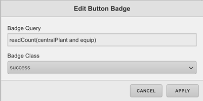
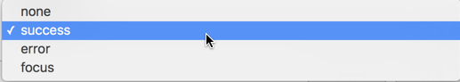
Badge Class: Allows you to select a css 'class' for your badge. Each class has its own color based on the selected theme. Class Colors can be reviewed here.
TIP: (We recommend adding 7-8 apostrophes to the display name to help accommodate the Badge and avoid any overlap)
NOTE: the badge only updates when the browser page is refreshed, it does not constantly poll 'live' values
Set Link: This is where you can determine what the button will do when clicked on.
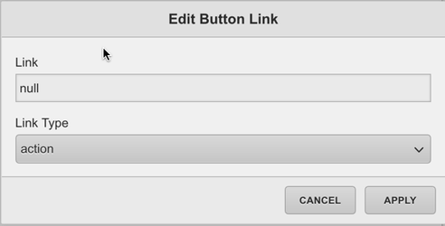
Link Type: Allows the user to select between an Action, Hash, URL, or Graphic. Each type is described in more detail here.
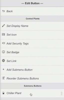
Edit Button
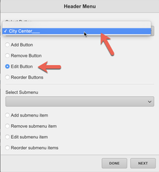
To edit an existing button go to the Header menu
- Select the button you'd like to edit and select the "edit" option from the slider.
- Clicking the edit button will bring you to the "Edit Button" menu.
**REFRESH the browser page to view your changes
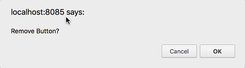
Remove Button
To remove an existing button first open the Header menu
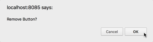
Select the Remove button option & select the Button you'd like to remove.
A confirmation pop-up will appear in your browser tab. Pres "OK" to remove it, or "cancel" to keep the button.
**REFRESH the browser page to view your changes
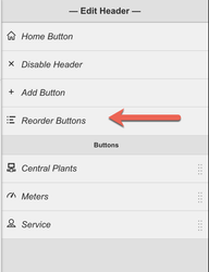
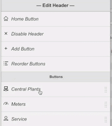
Reorder Buttons
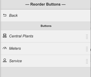
To re-order the existing custom header buttons first open the Header menu & select the Reorder Buttons option
The next menu will display all of your available buttons and give you the option to move them up or down
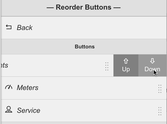
**REFRESH the browser page to view your changes
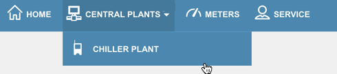
Submenu Buttons
Menu buttons can be turned into "dropdowns" that contain Submenu Buttons. See below for more info on how to add submenu buttons.
Add Submenu Button
To Add a SubMenu item first select the Button you would like to add a submenu button to and hit "edit"
Once you are in the edit button menu, click on the "add submenu button" option to automatically create a submenu button
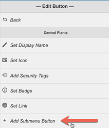
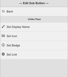
This will jump you over to the "Edit Sub Button" view.
**REFRESH the browser page to view your changes
(NOTE: Once a submenu button is added to the main button, the main button will no longer act as a "link" it will now become a dropdown list trigger, so if you had a link their previously, you may want to add it as a submenu button)
(NOTE: Security Tags are not available on SubMenu Buttons. Security Tags can only be assigned to the main button, so set your custom headers up accordingly)
Edit Submenu Button
To edit an existing button:
- Go to the Header menu
- Open the button that contains the submenu item
- Select the submenu button you'd like to edit
- Select the "edit" option from the slider
- Clicking the edit button will bring you to the "Edit Sub Button" menu
**REFRESH the browser page to view your changes
Remove Submenu Item
To remove an existing submenu button:
- Open the Header menu
- Open the edit view for the button that contains the submenu item you'd like to remove
- Select the submenu button
- Click on the "remove" option

- A confirmation pop-up will appear in your browser tab. Pres "OK" to remove it, or "cancel" to keep the button.
**REFRESH the browser page to view your changes
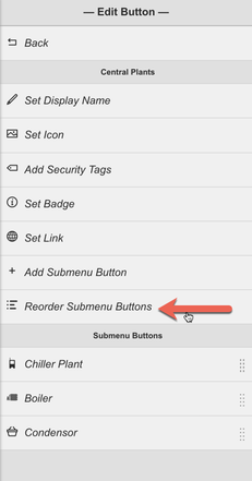
Reorder Submenu Buttons
To re-order the existing custom header buttons:
- Open the Header menu
- Select the Reorder Buttons option
- The next menu will display all of your available Sub buttons and give you the option to move them up or down

**REFRESH the browser page to view your changes