Summary
Summary
The Summary app allows the user to view and export summaries of multiple equip.
We have created a video of how to create and view the summaries here.
Using Summary
To get to the summaries, just select the Summary app on the menu.
When the Summary app is selected:
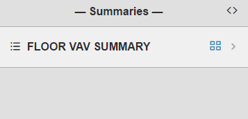
- It will switch the right side to the Mini app and display the summaries based on the context of where the user is in the navigation level
- If the user navigated to a floor, it'll display any summaries on the floor.
- From there the user can select on a summary or blue icon on the right of it to open them
Summary of Mobile View
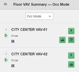
If the user selects the summary and not the blue icon, it will display the summary in mobile view.
In this mobile view, the user can select from the available points found in the dropdown to view that points summary.
- On each point, IF available, the user has the option to view that points actions, history, schedule info, point info (bubbles), and equip info (bubbles)
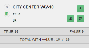
- Towards the bottom, depending on the type of point, you'll see the total count, sum, max, min, avg.
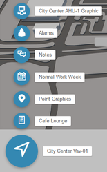
If the user selects the icon to the left of the summary name, they will get that particular equips related info bubbles.
From the bubbles, the user can do so much more like hyperlinking to that particular graphic or view alarms/schedule etc.
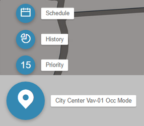
If the user selects the point icon to the left of the curVal of that point, they will get that particular points related info bubbles.
From the bubbles, the user can view other info regarding that point.
Summary Popup View
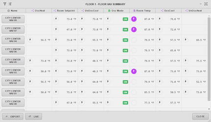
If the user selects the blue icon to the right of the summary, they will be presented with the summary popup view.
- In this popup view, the user can see all the points and do quite a handful of things like export, compare, command, hyperlink, show/hide, and more.
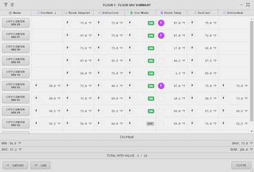
- If the user selects a column header, it would short the summaries based on that column and display the total count, sum, max, min, avg depending on type of point. In our example, we sorted the OccHeat column.
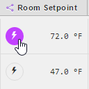
- If a point is commendable, the user can command it by selecting the lightning icon to the left of it. If the point is overridden, it'll change the background color of the lightning icon to purple.
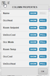
- If the user wants to show/hide or control which points get polled, they can do so by selecting the filter icon at the top left corner of the summary popup view.
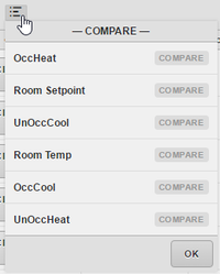
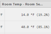
- If the user wants to compare two points side by side, they can do so by selecting the compare icon at the top left corner of the summary popup view next to the filter icon. Then the two selected point will appear on the right of the summary popup with the comparison.
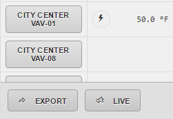
- If the user would like to export the summary to CSV, they can do so by selecting the Export button at the bottom left corner. They would select Live is they want to see live values.
- Note: if you have a lot of points, it would be best to select some that you don't need to poll so that it won't slow things down because polling a lot of points for every equip takes a toll on the performance
- If the user would like to resize the summary view, they have a few options. They can do so by using the drag on the bottom left corner or the minimize/full screen icons at the top right corner. When minimized, the summary will appear at the bottom left corner ontop of every page available to the user whenever they want to view it. They would just click on the '+' next to it to expand it back to the summary popup view.
- If the user selects any point or equip, the related info bubbles will appear at the bottom left corner. From there, the user can hyperlink to a graphic or view other useful info.

