Form Builder 2.0
Contents
Starting a Form
To facilitate the creation of a simple form, a function exists that automatically creates a basic form layout in the Funcs app.
Calling the function finCreateFormTemplate(name) will create a basic form function that you can find in the Funcs app under the name you gave it.
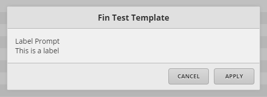
Calling finCreateFormTemplate("finTestTemplate") will create a form function called finTestTemplate which looks like this:
() => do
  body: [
  {name: "cancelButton", editorType: "button", label: "Cancel", controlBar: true},
  {name: "commitButton", editorType: "button", label: "Apply", controlBar: true}
  ]

  {"dis": "Fin Test Template",
  "name": "finTestTemplate",
  "body": body.toJSON,
  "cancelButton": "\$cancelButton",
  "commitButton": "\$commitButton",
  "commitAction": "null",
  "completeAction": "null",
  "finForm": marker()
  }.toGrid.addMeta({formExecute: marker()})
end
This is the most basic form structure, containing a body list with all of the "editor" elements and a dict at the bottom that makes up the actual form.
Warning! In order for forms to work, the dict at the bottom must be the value returned by the function, otherwise the form will not show up.
Editing a Form
Most of the changes you will ever make to a form will be in adding/modifying the editor dicts within the body list, and editing the commitAction/completeAction value within the bottom dict.
Keep in mind that elements will show up in a form in the order that they are in the body list; the exception are the buttons at the bottom which have the "controlBar: true" values.
Adding an element is a simple process.
First create the editor element you want (refer to the Form Editor Elements section for editor elements), the basic syntax is:
{name: "nameOfElement", editorType: "editorTypeFromList", prompt: "Header for element (optional)", parametersOf: "editor"}
The name element is an id of the editor dict, this should be unique, exceptions are editors that aren't used for input such as labels. This element is necessary.
The editorType element identifies what kind of editor the dict is representing. This element is necessary.
The prompt element can generally go on any editor and is like a header for that editor. This element is optional.
The parametersOf element doesn't exist but is used to represent the parameters that are displayed in the Form Editor Elements section. These elements depend on the editor.
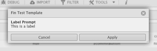
To create a label:
{name: "labelName", editorType: "label", prompt: "Label Prompt", text: "This is a label"}
Then insert it into the body list where you want it to show up, on top of the buttons:
body: [
{name: "nameofelement", editorType: "label", prompt: "Label Prompt", text: "This is a label"},
{name: "cancelButton", editorType: "button", label: "Cancel", controlBar: true},
{name: "commitButton", editorType: "button", label: "Apply", controlBar: true}
]
Don't forget to put a comma after each element that isn't the last one!
Editing an element works just by changing any parameter.
Editing the commitAction or completeAction just involves changing the value of the string.
Remember that commitAction is a string version of an Axon query.
Likewise, completeAction is a string version of a JavaScript query.
Both of these actions will only be run if the Apply button is pressed, and they can have parameters passed by using \$editorName in place of parameters from editors with names.
Previewing a Form
Through the Flash UI
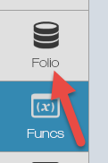
To view the changes that you made to a form with the Flash UI, you must go into the Flash Folio app.
Then type in the name of the function you made, with any parameters you might have included.
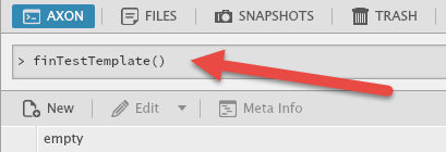
Hit the enter (or return) key and the form should pop up if all went well.
Through the HTML UI
The process to view a form in the HTML UI is a little more difficult unless you have made a menu button for it.
You will need to have the mobile pod enabled and have access to the right side mobile menu.
Right-click within the mobile menu and select Inspect or Inspect Element.
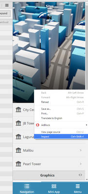
The developer tools console should pop, click on the console tab up top.
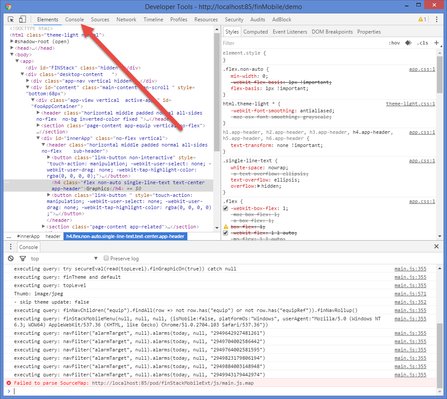
Once there, type in the command finstack.eval('nameOfFunction(parameters)')
In this case, the command would look like finstack.eval('finTestTemplate()')
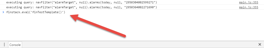
Hit enter and the form should pop up in the browser window as an HTML form.
Finalizing a Form
One a form is finished and ready to be integrated as a tool, it has to be prepared for that.
You will need to add tags to the form function in order to have it show up as a tool and act in certain ways.
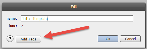
Click on the edit button at the top left of the function editor.
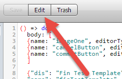
Then click on the "Add Tags" button to add tags.
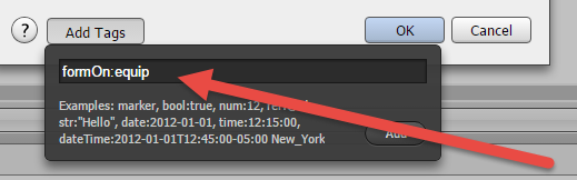
Then add the tag of choice, for example formOn: equip to make the form show up in the tools menu when an equip is selected.
Tags you can use:
formOn
formOn is a tag that runs on the function itself. This tag is required and is a filter of what it will run on. For example: If you want the form to only run on sites, then make formON = formOn:"site".
formOn runs on the server side, meaning the server looks at the filter on formOn, and checks it against the selected item typically using the ID. The server will return a list of the forms that match the selected record.
appFormOn
this is a string that is seperated by commas. folio,historian If that string exists then it would only open in folio and historian
uiFormOn
uiFormOn works similar to how it works on the server. Meaning, you just add a filter and now instead of the server checking the client will check. We use this mainly in the connectors app to check to see if the selected items match the uiFormOn. Below is a screen shot that might help explain it better.
Form Editor Elements
--- Button ---
editorType: "button"
label: "Apply" (the text that shows up in the button)
controlBar: true (optional, sets the button at the bottom for submit/cancel)
clickAction: "formName()" (optional, sets a form to open if you click the button)
Buttons are rarely used outside of the control bar (at the bottom).
ClickActions are rarely used on buttons.
The most common use is the cancel and submit buttons.
Example dict:
{name: "cancelButton", editorType: "button", label: "Cancel", controlBar: true},
{name: "commitButton", editorType: "button", label: "Apply", controlBar: true}
Button in Flash:

Button in HTML:

--- CheckBox ---
editorType: "checkbox"
label: "Click Here" (the text displayed to the right of the checkbox that describes this option)
defVal: false (optional, selected or not based on true or false, false is default)
selectedValue: value (optional, This is the value that the check box will return when it is true. If this field is entered, it will return nothing when false. If this field is omitted it will return true or false values)
Selected value actually returns nothing into the commitAction/completeAction queries, this would cause "commitAction": "echo(\$checkOne)" to execute echo() if the checkbox isn't checked which causes an error.
To get around that problem, you wrap the parameter in brackets so either an empty list or a list with the parameter is returned: "commitAction": "echo([\$checkOne])" to execute echo([]) if no checkbox is checked. This is valid.
Example dict:
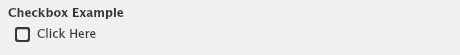
{name: "checkOne", editorType: "checkbox", prompt: "Checkbox Example", label: "Click Here", defVal: false}
CheckBox in Flash:
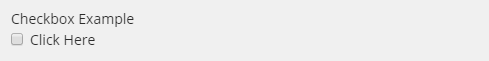
CheckBox in HTML:
--- ComboBox ---
editorType: "combobox"
dataProvider: "readAll(site)" (the data provider is an axon filter which will find the elements that will populate the combobox)
labelField: "dis" (this is the name of the tag that will be used as the display name for each entry in the list)
selectedValueTags: "id" (this is a comma-separated string of tags that will be returned from the selected item. If a single tag is passed, the result of the selection is a scalar value. If multiple tags are passed, the result is a dictionary of name/value pairs)
defIndex: 0 (optional, used to select which entry to show as default)
encapsulate: false (optional, not sure what this does)
Not using a defIndex will make nothing be selected by default, the collapsed bar will be blank until something is selected.
Example dict:
{name: "comboOne", editorType: "combobox", prompt: "Combobox Example", dataProvider: "readAll(site)", labelField: "dis", selectedValueTags: "id", defIndex: 0}
Combobox in Flash:


Combobox in HTML:


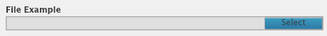
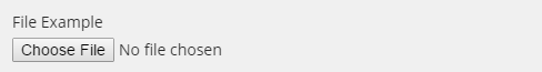
--- File ---
editorType: “file”
fileTypes: ["exe","jpg","bin"] (optional, list of acceptable file types - ["jpg", "png"] or ["exe"], blank string for any - [""])
multiple: false (optional, true for multi-selecting files)
tags: {thumbnail: marker(), form: "testForm"} (optional, adds specified tags to the uploaded file)
If no file is uploaded with this, then nothing will be returned in Flash, and a blank string will be returned in HTML.
In order for the file to be uploaded, the editor must be called in the commitAction of the bottom dict. The best way to do this is to set it like this: "commitAction": "readById(\$fileOne)"
Example dict:
{name: "fileOne", editorType: "file", prompt: "File Example", fileTypes: ["jpg","png"], tags: {thumbnail: marker()}}
File in Flash:
File in HTML:
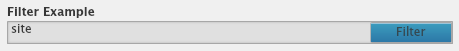
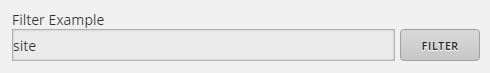
--- Filter Selector ---
editorType: "filter"
defVal: "site or equip" (optional but recommended, default filter)
Filter needs to use the parseFilter function when used for parameters of read/readAll.
Example dict:
{name: "filterOne", editorType: "filter", prompt: "Filter Example", defVal: "site"}
Filter in Flash:
Filter in HTML:
--- Image ---
editorType: “image”
path: @xxxxxxxx-xxxxxxxx (ref to the image file, can also be a string of url to image)
width: 100 (optional, preferred width of the image)
height: 100 (optional, preferred height of the image)
Generally URLs are not used as refs are preferred, URLs also may have a loading time and require internet connection.
This editor ONLY work in Flash.
Example dict:
{name: "imageOne", editorType: "image", prompt: "Image Example", path: "https://raw.githubusercontent.com/plu/JPSimulatorHacks/master/Data/test.png", height: 100}
Image in Flash:

--- Label ---
editorType: “label”
text: "this is what gets shown" (this is the text of the label)
asdf
Example dict:
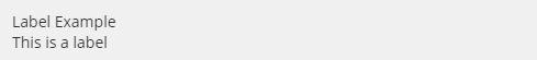
{name: "labelOne", editorType: "label", prompt: "Label Example", text: "This is a label"}
Label in Flash:

Label in HTML:
--- List ---
editorType: "list"
dataProvider: "readAll(site)" (the data provider is an axon filter which will find the elements that will populate the list)
labelField: "dis" (this is the name of the tag that will be used as the display name for each entry in the list)
selectedValueTags: "id" (this is a comma-separated string of tags that will be returned from the selected item. If a single tag is passed, the result of the selection is a scalar value. If multiple tags are passed, the result is a dictionary of name/value pairs. If selectedValueTags value property is not there, then the value will return the dict)
listType: "checkbox" or "radio" (optional, radio is default and returns a record, checkbox returns a list of records)
height: 200 (optional)
defIndex: 0 (optional, used to select a default entry, only works with listType: "radio")
defValTagName: "boolTag" (optional, if you have a column in the data that you want to default the checkBox to true or false, then use this to tell which column to look at)
resultType: "dict" (optional, not sure what this does)
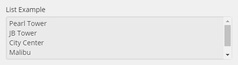
Using listType: "radio" in HTML will make the list look and act like a combobox.
Using listType: "checkbox" in HTML will make the list look similar to a list in Flash.
A list in Flash will only show checkboxes if listType: "checkbox" is enabled.
Example dict:
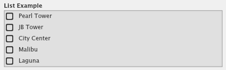
{name: "listOne", editorType: "list", prompt: "List Example", dataProvider: "readAll(site)", labelField: "dis", selectedValueTags: "id", listType: "checkbox"}
List in Flash:
List in HTML:
--- List with ItemRenderer ---
A list can also have a customer item renderer in it. It allows you to add othre components to each node in the list. IE... A numeric Stepper, checkbox, combo box etc... It also has a enableOn property which is basically an hFilter that will only show that component if the row of data coming back matches the filter.
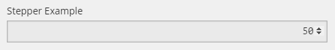
--- NumericStepper ---
editorType: "numericstepper"
minVal: 0 (optional, minimum selectable value)
maxVal: 100 (optional, maximum selectable value)
defVal: 50 (optional, default selected value)
step: 2 (optional, default increment/decrement value for arrows, precision defined by number, HTML only)
The default value will start from 0 if no parameters are specified, or from the minVal if there is no defVal.
Example dict:
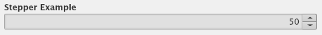
{name: "stepperOne", editorType: "numericstepper", prompt: "Stepper Example", minVal: 0, maxVal: 100, defVal: 50}
NumericStepper in Flash:
NumericStepper in HTML:
--- Poll ---
editorType: “poll”
dataProvider: the axon to be evaluated in every poll. This is the value passed to progressbar e.g. "jobStatus(\"id\")[0]→progress"
pollTime: timer time in milliseconds to repeat calls
type: ”progress” for progressbar , or “label” for label. This is just display type
total: max value to stop polling when reached.
--- Radio Button ---
editorType: "radio"
label: "Option 1" (the text displayed to the right of the radio button that describes this option)
group: "group1" (optional but recommended, the name of the group that this radio button belongs to)
selectedValue: 1 (the value that the radio button will return when selected)
defVal: true (optional but recommended on only the first option, chooses which radio button to select by default)
Prompt may not work on radio buttons in HTML yet.
Groups are used to group sets of radio buttons, otherwise they all act like one group without it.
DefVal should only be used on the first radio button, or whichever radio button you want to be the default.
Example dict:
{name: "radioOne", editorType: "radio", prompt: "Radio Example", label: "Option 1", group: "group1", selectedValue: 1, defVal: true},
{name: "radioOne", editorType: "radio", label: "Option 2", group: "group1", selectedValue: 2}
Radio in Flash:
Radio in HTML:
--- Reference Selector ---
editorType: “reference”
tagName: This is the tagName that is used to filter the selectable items in the reference selector.
Example dict:
{name: "input10", editorType: "reference", prompt: "Ref", tagName: "equip"}
--- Separator ---
editorType: “separator”
label: "this is what gets shown" (this is the text that is shown inside of the separator)
The separator in HTML does not have a prompt.
Separators are used for getting attention or visually splitting parts of a form.
Example dict:
{name: "separatorOne", editorType: "separator", prompt: "Separator Example", label: "This is a separator"}
Separator in Flash:

Separator in HTML:

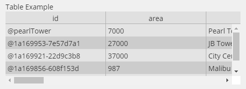
--- Table and Paste UI ---
editorType: "table"
dataProvider: "readAll(site)" (the data provider is an axon filter which will find the elements that will populate the table)
height: 200 (optional, height of editor)
You can copy from the table by right clicking and hitting copy, and then paste into Excel. This will let the user then edit it, and bring it back into Excel.
An empty table will allow you to paste data into it from Excel or Google Spreadsheets.
Example dict:
{name: "tableOne", editorType: "table", prompt: "Table Example", dataProvider: "readAll(site)"}
Table in Flash:
Table in HTML:
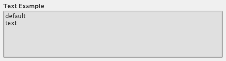
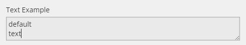
--- TextArea ---
editorType: "textarea"
defVal: "default\ntext" (optional but recommended to have with at least an empty string: "")
height: 200 (optional)
editable: false (optional, default true, set to false to turn off editing, used for multi-line display)
Not having a defVal and submitting the textInput without any value may cause the form to report an error.
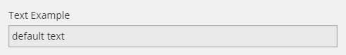
Example dict:
{name: "textTwo", editorType: "textarea", prompt: "Text Example", defVal: "default\ntext"}
TextArea in Flash:
TextArea in HTML:
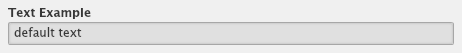
--- TextInput ---
editorType: "textinput"
defVal: "default text" (optional but recommended to have with at least an empty string: "")
password: true (optional, will mask text with dots for security, only works in HTML)
Not having a defVal and submitting the textInput without any value may cause the form to report an error.
Example dict:
{name: "textOne", editorType: "textinput", prompt: "Text Example", defVal: "default text"}
TextInput in Flash:
TextInput in HTML:
--- Tree ---
editorType: “ractive”
ractiveType: "tree"
labelField: his is the name of the tag that will be used as the display name for each entry in the tree.
selectedValueTags: This is a comma-separated string of tags that will be returned from the selected item. If a single tag is passed, the result of the selection is a scalar value. If multiple tags are passed, the result is a dictionary of name/value pairs.
path: can be a function or a filter that will populate the tree. For points, use "treeName:equip" to show a full tree of the db or "filteredTree:point and temp" to filter for certain points.
allowMultiSelection: set to true to allow for multiselect
Tips 'N' Tricks
Any editor that has a dataProvider parameter can be updated dynamically by putting the \$editorName of another editor.
"gotoAction": "finstack:historian:recIds=@Carytown.ElecMeter-Main.Cost",
"confirm": "This will change things, are you sure?",
"gotoAction": "finstack:builder:recId=@" + id,
If you want to call the refresh trees in FIN Stack, just add the refreshTrees marker, like below.
Will refresh db builder site/floor/equip/point trees to view changes of adding something to the tree
"refreshTrees": marker()
"confirm": "This will change things, are you sure?",
You can also pass in the clipboard value, by putting it into a form parameter. See below.
(id,selectedDicts, finClipboard_points_copiedPoints:null) => do
Icons on forms or prompts
headerIconLeft:@123
headerIconRight:@123
iconLeft:@123
iconRight:@123 (Can also be a uri or a string)
headerToolTip:" Tool tip man"
toolTip:"Tool Tip stuff"
We now have access to icons that ar embeded into FIN Stack. By using this syntax.
iconLeft: "internal:TABLE_ICON"}