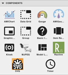
GB Components
- Christopher Simonian
- Ricky Villa
- Sarah Padilla (Unlicensed)
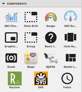
COMPONENTS
| Icon | Name | Builder View | Description |
|---|---|---|---|
 | AM|Chart | 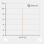 | AM|Charts can be used to display data from a query or points. They are used in combination with a program and a group. It can display the historical data of point(s). An example query this: read(id==@1eeb0007-121ebcfe).hisRead(yesterday). More examples can be found here: GB AM Charts Here is another example: GB Custom Charts |
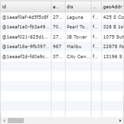
 | Data Grid |  | It’s based on a virtualPoint with a query tag. For example, create virtualPoint. Add query tag with value being “site”. Then bind to the component. Shows grid of all site data in preview.
|
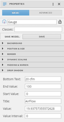
 | Gauge | 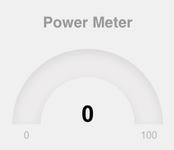 | Can be defined in the properties panel under basic. There can be a label, min, max, and value. This is also where the color can be changed. |
 | AM|Gauge | 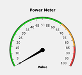 | AM|Gauge can be used in combination with a group and a program to show one of the gauges from AM|Charts. An example of an AM|Gauge can be found here: /wiki/spaces/FINFramework/pages/770708694 |
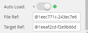
 | Graphic Include |  | Auto Load determines if the include loads the graphic at first launch or loaded when triggered by something else. This is meant to display graphics. It takes the id without the “id==” of both the graphic and target.
|
 | Group |  | Works the same as selecting multiple objects and right clicking > create group. Can view and add components to the group in the Layers panel or by selecting, holding Ctrl and drag/drop on group component until you see a dark border
|
 | Basic Image | | |
 | Image Renderer | | |
 | Kiosk |  | |
 | Maps | 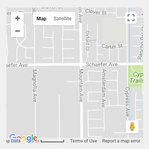 |
|
 | MJPEG |  | |
 | Model Loader | | This is basically models. If you group some components, then save them as model in properties. You can then use them from Components panel or drag it out from Assets to modify. |
 | Ractive | | Drag and drop Ractive from the components menu into the workspace. In the Properties panel on the basic tab, under Ractive Editor, click Open Editor. In the Ractive Editor, HTML goes in Template, Ractive in Model, CSS in Style, and Javascript in INIT. More examples can be found here: GB Ractive |
 | SVG | | |
 | Timer |  | The time can be used to set a delay or have something run and keep refreshing. It will disappear so it won’t be visible in the viewer, but will run in the background using tags that can be set on programs and other components. Example on program is creating a timer var like below.
|
HTML COMPONENTS
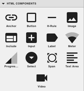
| Icon | Name | Builder View | Description |
|---|---|---|---|
 | Anchor |  | 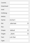 |
 | Button |  | Can be dragged out and apply JavaScript code to Create Event by right clicking on the object.
|
 | H-Rule |
| Horizontal rule (line), can define the size in the properties menu and can adjust the color and thickness; A separating line used to define a thematic break in the graphic; https://www.w3schools.com/tags/tag_hr.asp |
 | Image |  | Add the link to the image in the “Src:” in the properties panel under basic, at the bottom
|
 | Include |  | |
 | Input |
| |
 | Label |  | Used to display text. Can apply classes to the label in the Properties panel under basic for style. |
 | Meter |  | |
 | Progress |  | |
 | Select |
| |
 | Span | ||
 | Text Area |  | |
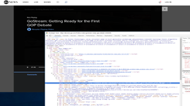
 | Video |  | This supports h.264 video. Can place a video. Place link to video in the “Src:” section of the properties menu, under the Basic tab. Example we went here http://abcnews.go.com/Politics/video/gostream-ready-gop-debate-32928594 and then inspected the video to get the video uri: http://ondemand.abcnews.com/playback/abcnews/2015/08/150806_dvo_gostream_debate_prep1_700.mp4
|
NOTES
Heat Exchanger
If you want to use the heat exchanger, you can change the source property in the advanced section of the properties panel to one of the below paths to get a different view of it.
- Normal - /finPod/fin5CentralPlant2DViewExt/assets/heatExchangers/fin2d_heatExchanger.fgx
- Side - /finPod/fin5CentralPlant2DViewExt/assets/heatExchangers/fin2d_heatExchangerSide.fgx
- Front - /finPod/fin5CentralPlant2DViewExt/assets/heatExchangers/fin2d_heatExchangerFront.fgx
Humidifier
If you want to use the humidifier, you can use it as it is. There is a simple issue with it and that is if the value is false, it'll display the last frame it was on instead of the actual 'off' frame we set. Didn't get a chance to resolve it, so below is a workaround program that handles this. Follow the below steps and it should work.
- Download program below called humidifierProgram
- Upload it through Copy Records > Upload - Its on the right side bar when in Graphics Builder
- Then just drag out the Humidifier component if not already dragged out
- Bind point to it
- Remove the "ductComponent" marker tag from it
- Thats it, should be good to go
COMPONENT EXAMPLES
AM|Charts
AM|Charts can be used to display a point’s historical data via a query or a virtual point. AM|Charts are typically used in combination with a program and a group.
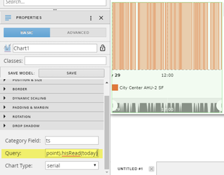
To show a point’s history by using a query:
- Drag the AM|Chart component from the Component palette out onto the world.
- Select the AM|Chart component.
- Under the Basic tab in the Properties palette, scroll down until you see the Query field.
- Enter the following query: read(point and his).hisRead(today)
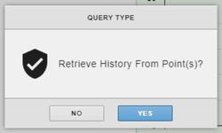
To show a point’s history via a virtual point:
- Drag the AM|Chart component from the Component palette onto the world.
- Drag a virtual point from the Virtual Points palette onto the AM|Chart component.
- Click “Yes” on the alert window.
Other properties:
- Category Field: This is the x-axis of the chart. For point histories this will usually be “ts”, the time value associated with each record of history.
- Chart Type: This is the visual representation of the history on the AM|Chart Component, e.g. bar, pie, serial, etc.
More examples can be found at:
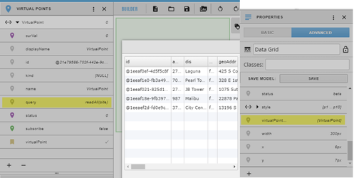
Data Grid
Displays a spreadsheet-like view of data depending on the query property attached to a virtual point.
To set up a Data Grid component:
- Drag the Data Grid component from the Components palette onto the world.
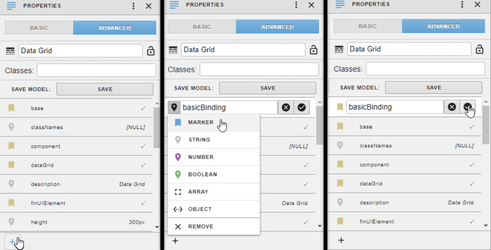
- Select the Data Grid component.
- Add the basicBinding Marker tag to the Data Grid component:
- Under the Advanced tab in the Properties palette, click the plus (+) button in the lower left corner of the palette to add a new property.
- Change property to be a Marker Tag by clicking on the icon to left of the input field that appears.
- Enter basicBinding as the name of the Marker Tag.
- Click the checkmark button to the right of the input field to apply changes.
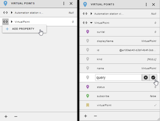
- Open the Virtual Points palette and create a virtual point.
- Click the plus (+) button on the lower left corner of the palette to add a new virtual point.
- Name the virtual point (if desired) and click the checkmark button to the right of the input field to apply changes.
- Add a query property to the virtual point.
- Click the <...> button next to the left of the virtual point and select “Add Property”.
- Name the property query and click the checkmark button to the right of input field to apply changes.
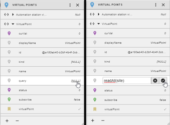
- Click the value of the property located on the right of the property name (usually [NULL]) to set the value of the property.
- Enter a query as the value of the property that will be used gather the data displayed in the Data Grid component, in this case: readAll(site) and click the checkmark button to the right of the text-input box to apply changes.
- Drag the virtual point from the Virtual Point palette onto the Data Grid Component to bind the virtual point to the component.
- Click the Preview button in the upper right to see the data.
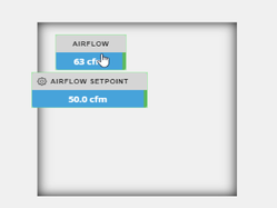
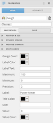
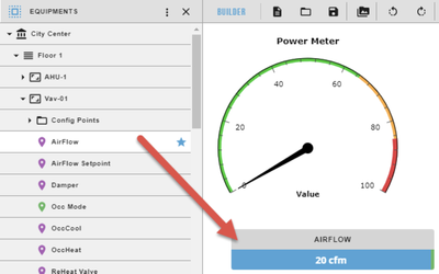
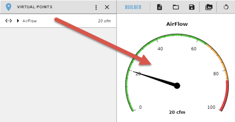
Gauge
Typically a visualization of a virtual point’s current value in the form of a gauge.
To configure the gauge:
- Drag the Gauge component from the Components panel onto the world
- Select the Gauge component
- Configuration options for the Gauge can be found in the Basic Properties panel
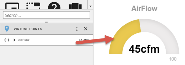
- Go to the Equipments panel and drag out a numeric point that you wish to use for the Gauge component, this will create a smart label
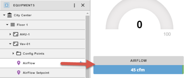
- Go to the Virtual Points panel and find the virtual point of the point that you dragged out in the last step. Make sure to drag the virtual point onto the Gauge component to link it to the Gauge
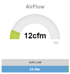
- If something other than the default configuration is required, then properties like the label, min, max, and color can be changed through the Basic Properties panel
- Click the preview button in the upper right to see the Gauge updating with the curVal
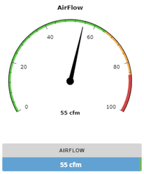
AM|Gauge
AM|Gauge can be used to display the curVal of a point. AM|Gauge is typically used in combination with a group and a program to show one of the gauges from AM|Charts. The basic usage works like the gauge above.
To configure the AM|Gauge:
- Drag the AM|Gauge component from the Components panel onto the world
- Go to the Equipments panel and drag out a numeric point that you wish to use for the Gauge component, this will create a smart label
- Go to the Virtual Points panel and find the virtual point of the point that you dragged out in the last step. Make sure to drag the virtual point onto the AM|Gauge component to link it to the Gauge
- If something other than the default configuration is required, then properties like the title, start value, and end value can be changed through the Basic Properties panel
- Click the preview button in the upper right to see the AM|Gauge update with the curVal
Graphic Include
This creates a frame specifically for rendering a graphic within another graphic
To configure the Graphic Include:
- Drag the AM|Gauge component from the Components panel onto the world
- Select the AM|Gauge and go to the Basic Properties panel
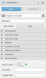
- Get the id of the graphic file that you want to display and paste it into the File Ref property
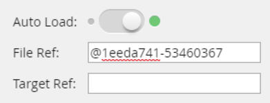
- Get the id of the target that you want your graphic to act on. This target is the site or equip or floor that you want the graphic to use
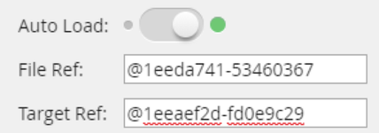
- The Auto Load selector determines whether to load the graphic within the frame at the start of the main graphic, or whether to wait until an event triggers the frame to load
- Click the preview button in the upper right to see the Graphic Include with a small graphic inside of it
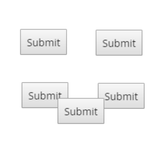
Group
This component is used to group multiple components together. This is like having a component made out of sub-components.
To use the Group component:
- Drag a few components onto the world and arrange them as you’d like

- Drag the Group component from the Components panel onto the world and place it over the components you want to group
- Resize the group so that it fits nicely over the components
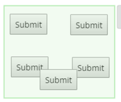
- Go to the Layers panel and drop down the Layers option
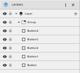
- Select all the components to be grouped by using either Shift+Click or Ctrl+Click
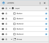
- Drag the highlighted components onto the Group component in the Layers panel
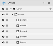
- The components will now be grouped in a bounding box the size of the Group that was resized and will all move together if the group is moved
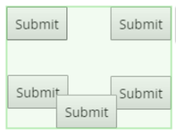
A simpler way to use the group component:
- Drag a few components onto the world and arrange them as you’d like
- Highlight the components with the mouse
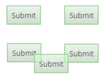
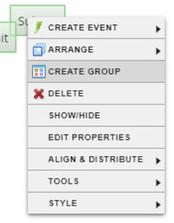
- Right click one of the highlighted components and click Create Group
- The components will now be grouped
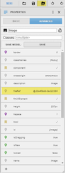
Basic Image
This component displays an image within a box
To configure the Basic Image:
- Drag the Basic Image component from the Components panel onto the world
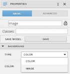
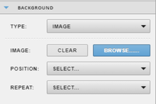
- Select the Basic Image and go to the Background section of the Basic Properties, select the Image option in the Type dropdown
- Click the Browse button that appears
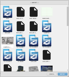
- Select an image in the Import selection that pops up and click Import
- Images can be added to this prompt by dragging them into the graphic and then deleting them, or by uploading them into Folio Files
- Click the preview button in the upper right to see the Basic Image

Item Renderer
-
Kiosk
Flips between graphics.
MJPEG
This component displays an MJPEG image stream. This only supports MJPEG encoded CCTV videos.
To configure the MJPEG component:
- Drag the MJPEG component from the Components panel onto the world
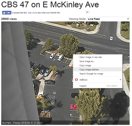
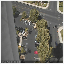
- Find an MJPEG image stream and get its URL by right clicking on the image and copying the address
- The image at http://www.opentopia.com/webcam/16391 was used as an example
- Select the MJPEG component and paste the URL of the MJPEG stream into the Source field in the Basic Property panel
- The Delay field can be used to delay the update rate of the image
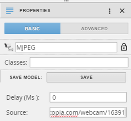
- Click the preview button in the upper right to see the MJPEG component displaying the image stream
Model Loader
This is like a component made out of a group.
To make a Model Loader:
- Follow the instructions from the Group section to make a group of components
- Name the group and click the Save button in the Basic Properties panel
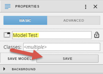
- Scroll to the Models section of the Components panel to find the model you just made
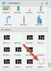
- The model can now be dragged out as a component
To edit the model:
- Use the Import button to import the model into the world

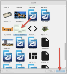
- Edit the model as if it’s just a simple group, then save it just like in the above instructions
Ractive
Drag and drop Ractive from the components menu into the workspace. In the Properties panel on the basic tab, under Ractive Editor, click Open Editor. In the Ractive Editor, HTML goes in Template, Ractive in Model, CSS in Style, and Javascript in INIT. More examples can be found here: GB Ractive
SVG
Needs “fileRef” tag with the id of the svg file.
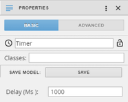
Timer
The timer can be used to set a delay on a program or have a program run and keep refreshing. It will only be visible in the graphics editor and will run in the background.
To configure a Timer:
- Drag the Timer component from the Components panel onto the world
- Set the interval delay with the Delay field (in milliseconds)
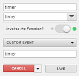
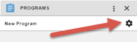
To use a Timer on a Program:
- Go to the Programs panel and click the gear to edit the program
- Click the 3 dots at the top-right corner of the program editor
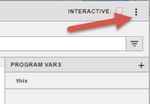
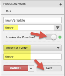
- Click the plus and then the gear of the new variable
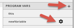
- Add “timer” into the filter, set the Invoke slider to true, use a Custom Event that uses the timer. Then click Save
- Save the program, the program should run at each specified interval when in the preview or viewer
HTML COMPONENT EXAMPLES
Anchor
The Anchor component is the HTML hyperlink element (<a>); it can take users to web pages on the Internet . The Anchor component is created with several default values and, at a minimum, only requires a web address to be provided in the href attribute.
Below is a table with a quick description for each available attribute for the Anchor component; for more information about the anchor attributes or the hyperlink element visit https://www.w3schools.com/tags/tag_a.asp.
Anchor Attributes
Attributes | Value | Description |
Coords | coordinates | Used with the “Shape” attribute to specify size, shape, and placement. |
Download | Filename (optional) | Specifies that the target will be downloaded. Including a value will specify the default name of the downloaded file. |
Href | URL | URL of the linked page |
Hreflang | language code | Specifies language of the linked document. |
Media | media query | Specifies what media/device the linked document is optimized for |
Name | text | Name of the anchor element |
Rel | alternate, author, bookmark, external, help, license, next, nofollow, noreferrer, noopener, prev, search, tag | Specifies the relationship between the current document and the linked document |
Rev | text | Specifies the relationship between the current document and the linked document |
Shape | default, rect, circle, poly | Used with “Coords”. Specifies the shape of a link |
Target | _blank, _parent, _self, _top, framename | Specifies where to open the linked document |
Text | text | Text that shows in the graphic |
Type | media_type | Specifies the media type of the linked document |
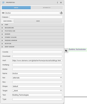
To create an anchor that opens links to the Siemens Building Technologies website in a new window or tab:
- Drag the Anchor component from the Component Palette onto the world and select the component.
- Under the Basic tab in the Properties palette, scroll down to the anchor attributes.
- Enter a full web address to the desired web site, for this example: https://www.siemens.com/global/en/home/products/buildings.html
- Change the text attribute to Building Technologies.
- Preview the graphic and click on the anchor component.
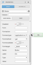
Button
The Button component is the HTML button element (<button>); it is typically used to start some sort of action or function within the graphic. The Button component is created with several default values and, at a minimum, needs an action to be specified.
Below is a table with a quick description for each available attribute for the Button component; for more information about the button attributes or the button element visit https://www.w3schools.com/tags/tag_button.asp.
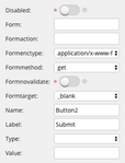
Button Attributes
Attributes | Value | Description |
Disabled | disabled | Specifies a button should be disabled |
Form | form_id | Specifies one or more forms the button belongs to |
Formaction | URL | Specifies where to send the form-data when a form is submitted.*" |
Formenctype | application/x-www-form-urlencoded, multipart/form-data, text/plain | Specifies how form-data should be encoded before sending it to a server. * |
Formmethod | get, post | Specifies how to send the form-data (which HTTP method to use).* |
Formnovalidate | formnovalidate | Specifies that the form-data should not be validated on submission.* |
Formtarget | _blank, _self, _parent, _top, framename | Specifies where to display the response after submitting the form.* |
Name | name | Specifies a name for the button |
Label | label | Specifies the text on the button |
Type | button, reset, submit | Specifies the type of button |
Value | text | Specifies an initial value for the button |
*Only for type="submit"
To make a button that displays a JavaScript alert dialog box and switches the button’s text:
- Drag a Vutton component from the Component palette to the world select the component.
- Under the Basic tab in the Properties palette, scroll down to the button attributes.
- Set the label attribute to “On”.
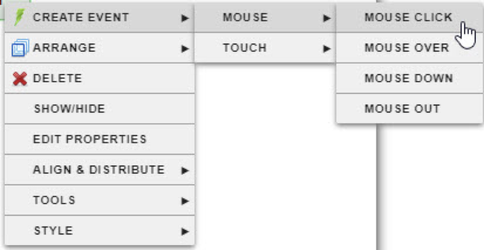
- Now add a click event onto the button by right-clicking on the button component and then selecting Create Event -> Mouse -> Mouse Click.
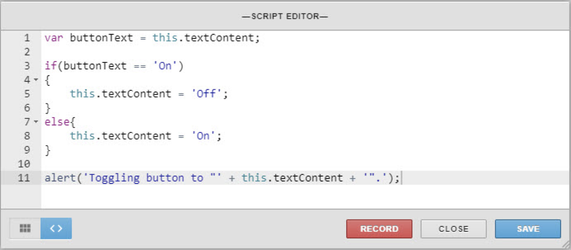
- Enter the code below, save it, and test out the button through the preview mode.
H-Rule
The H-Rule component is the HTML horizontal-rule element (<hr>); the H-Rule component is a separating line used to define a thematic break in the graphic. The H-Rule component is ready use once created and can be manipulated through mouse control or through properties and and attributes found in the Basic tab in the Properties palette.
Below is a table with a quick description for each available attribute for the H-Rule component; for more information about the H-Rule attributes or the horizontal-rule element visit https://www.w3schools.com/tags/tag_hr.asp.
H-Rule Attributes
Attributes | Value | Description |
Color | color | Specifes the color of the <hr> element |
Noshade | noshade | Specifies that a <hr> element should render in one solid color (noshaded), instead of a shaded color |
Size | pixels | Specifies the height of a <hr> element |
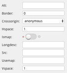
Image
The Image component is the HTML image element (<img>); it is used to display an image (jpg, png, gif, etc). When the Image component is created Components palette the src attribute will need to be specified. This is usually the address of and image on a server or webpage.
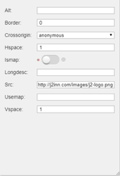
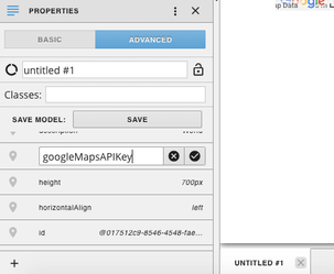
Likewise, an image component is created when an image is dropped onto the world or imported from the View Assets tool, but instead of using the src attribute, the component instead uses the fileRef property that can be found under the Advanced tab in the Properties palette.
Below is a table with a quick description for each available attribute for the Image component; for more information about the image attributes or the image element visit https://www.w3schools.com/tags/tag_img.asp.
Image Attributes
Attributes | Value | Description |
alt | text | Specifies an alternate text for an image |
border | pixels | Specifies the width of the border around an image |
crossorigin | anonymous use-credentials | Allow images from third-party sites that allow cross-origin access to be used with canvas |
hspace | pixels | Specifies the whitespace on left and right side of an image |
ismap | ismap | Specifies an image as a server-side image-map |
longdesc | URL | Specifies a URL to a detailed description of an image |
src | URL | Specifies the URL of an image |
usemap | #mapname | Specifies an image as a client-side image-map |
vspace | pixels | Specifies the whitespace on top and bottom of an image |
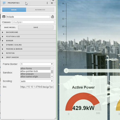
Include
The Include component is the HTML iframe element (<iframe>). The Include component allows embedding of a webpage into a graphic by setting the src attribute to the website’s web address. There may be some restriction as to which websites can be added to an Include component, for example if a web page has its ‘X-Frame-Options’ to ‘sameorigin’, then the iFrame will be unable to display that webpage if the domain names differ. Likewise, trying to use Include component to display a non-secure web-page (http) on a secure web page (https) will also mot work.
Below is a table with a quick description for each available attribute for the Include component; for more information about the include attributes or the iFrame element visit https://www.w3schools.com/tags/tag_iframe.asp.
Include Attributes
Attributes | Value | Description |
frameborder | 1, 0 | Specifies whether or not to display a border around an <iframe> |
sandbox | allow-forms, allow-pointer-lock, allow-popups, allow-same-origin, allow-scripts, allow-top-navigation | Enables an extra set of restrictions for the content in an <iframe> |
scrolling | yes, no, auto | Specifies whether or not to display scrollbars in an <iframe> |
src | URL | Specifies the address of the document to embed in the <iframe> |
In this example, the sample graphic “Sample Dashboard Facility Manager” will be displayed within the Include component:
- Enable and view the “Sample Dashboard Facility Manager” graphic through DailyOp.
- While viewing the graphic, use the URL tool to copy the link of the graphic and save that for later use to some text editor. (To copy the URL, view the graphic, click the tools icon in the upper right of DailyOP, select Tools, slide out “Configure graphics”, and click URL)
- Next, with Graphic Builder open, drag an Include component from the Components palette onto the world and select the component and resize it as needed.
- Scroll down the Include attributes under the Basic tab in the Properties palette.
- Set the src attribute to the URL of the “Sample Dashboard Facility Manager” graphic. The graphic (or web page) should now appear within the Include component.
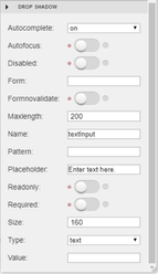
Input
The Input component is the HTML input element (<input>); an element used for gathering input from the user typically in the form of a text-box. An Input component can also take the form of a text-area, checkbox, file upload, radio buttons, etc.
Below is a table with a quick description for each available attribute for the Input component; for more information about the input attributes or the input element visit https://www.w3schools.com/tags/tag_input.asp.
Input Attributes
Attributes | Value | Description |
autocomplete | on, off | Specifies whether an <input> element should have autocomplete enabled |
autofocus | autofocus | Specifies that an <input> element should automatically get focus when the page loads |
disabled | disabled | Specifies that an <input> element should be disabled |
form | form_id | Specifies one or more forms the <input> element belongs to |
formnovalidate | formnovalidate | Defines that form elements should not be validated when submitted |
maxlength | number | Specifies the maximum number of characters allowed in an <input> element |
name | text | Specifies the name of an <input> element |
pattern | regexp | Specifies a regular expression that an <input> element's value is checked against |
placeholder | text | Specifies a short hint that describes the expected value of an <input> element |
readonly | readonly | Specifies that an input field is read-only |
required | required | Specifies that an input field must be filled out before submitting the form |
size | number | Specifies the width, in characters, of an <input> element |
type | button, checkbox, color, date, datetime-local, email, file, hidden, image, month, number, password, radio, range, reset, search, submit, tel, text, time, url, week | Specifies the type <input> element to display |
value | text | Specifies the value of an <input> element |
To create a text input that will attempt to auto-complete and has a placeholder text of “Enter text here.”:
- Drag an Input component from the Components palette onto the world and select it.
- Under the Basic tab in the Properties palette, scroll down to input attributes.
- Set the placeholder attribute to “Enter Text Here”.
Label
The Label component is the HTML label element (<label>) and is used to display simple text in the graphic. The text can be modified (size, color, font, etc.) through the properties and attributes found under the Basic tab in the Properties palette when the Label component is selected.
Below is a table with a quick description for each available attribute for the Label component; for more information about the label attributes or the label element visit https://www.w3schools.com/tags/tag_label.asp.
Label Attributes
Attributes | Value | Description |
Form | form_id | Specifies one or more forms the label belongs to |
Text | text | Specifies the text that should be shown in the label |
Meter
The Meter component is the HTML meter element (<meter>) and is rendered as a simple bar. High, Low, Min, Max, Optimum, and Value can be defined in the Properties panel under Basic. User can also drag and drop a virtual point onto the meter to display a specific point’s curVal as the value property.
Below is a table with a quick description for each available attribute for the Meter component; for more information about the meter attributes or the meter element visit https://www.w3schools.com/tags/tag_meter.asp.
Meter Attributes
Attributes | Value | Description |
High | number | Specifies the range that is considered to be a high value |
Low | number | Specifies the range that is considered to be a low value |
Max | number | Specifies the maximum value of the range |
Min | number | Specifies the minimum value of the range |
Optimum | number | Specifies what value is the optimal value for the gauge |
Value | number | Required. Specifies the current value of the gauge |
Progress Bar
The Progess Bar component is the HTML progress element (<progress>) and is similar to the meter bar. Max, Label, and Value can be defined in the Properties panel under Basic. User can also drag and drop a virtual point onto the meter to display a specific point’s curVal as the value property.
Below is a table with a quick description for each available attribute for the Progress component; for more information about the progress bar attributes or the progress element visit https://www.w3schools.com/tags/tag_progress.asp.
Progress Attributes
Attributes | Value | Description |
Max | number | Specifies how much work the task requires in total |
Label | number | |
Value | number | Specifies how much of the task has been completed |
Select
The Select component is the HTML drop-down list (<select>). The options that populate the list need to be supplied by a program. These can be the results of a query to the finstack database using finstack.eval or a hard-coded list supplied in the function.
Below is a table with a quick description for each available attribute for the Select component; for more information about the select attributes or the select element visit https://www.w3schools.com/tags/tag_select.asp.
Select Attributes
Attributes | Value | Description |
Disabled | disabled | Specifies that a drop-down list should be disabled |
Form | form_id | Defines one or more forms the select field belongs to |
Multiple | multiple | Specifies that multiple options can be selected at once |
Name | name | Defines a name for the drop-down list |
Required | required | Specifies that the user is required to select a value before submitting the form |
Size | number | Defines the number of visible options in a drop-down list |
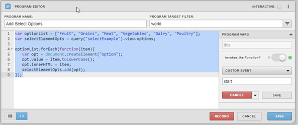
To create a drop-down list of food groups that is populated using the following program:
- Drag the Select component from the Components palette onto the world.
- Create a new program by going to the Programs palette and clicking the plus (+) button located on the lower left corner of the palette.
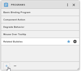
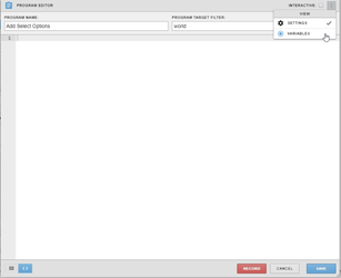
- Name the program and set the program target filter to “world”.
- Click the three vertical dots to open the “Program Vars” view.
- Toggle the “this” variable to invoke the function.
- Click the drop-down menu that appears below the toggle button and select “Custom Event”.
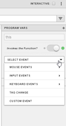
- Set the custom event name to “start” and click the grey “Save” button directly below the text input box.
- Enter the code below and click the blue “Save” button.
- Preview your graphic.
Span
Span element similar in behavior to an HTML span but specific to graphics components. For more information on the span attributes or the span element visit https://www.w3schools.com/tags/tag_span.asp.
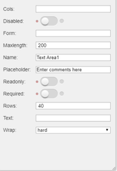
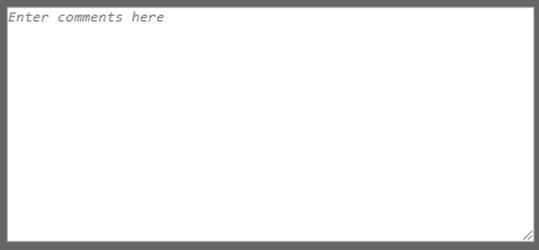
Text Area
The Text Area component is the HTML text-area element (<textarea>). It displays a text input that is larger than a single line. Typically used to get input from a user for programs within the graphic.
Below is a table with a quick description for each available attribute for the Text Area component; for more information about the text-area attributes or the text-area element visit https://www.w3schools.com/tags/tag_textarea.asp.
Text Area Attributes
Attributes | Value | Description |
Cols | number | Specifies the visible width of a text area |
Disabled | disabled | Specifies that a text area should be disabled |
Form | form_id | Specifies one or more forms the text area belongs to |
Maxlength | number | Specifies the maximum number of characters allowed in the text area |
Name | text | Specifies a name for a text area |
Placeholder | text | Specifies a short hint that describes the expected value of a text area |
Readonly | readonly | Specifies that a text area should be read-only |
Required | required | Specifies that a text area is required/must be filled out |
Rows | number | Specifies the visible number of lines in a text area |
Text | text | Specifies the text that is present in the text area |
Wrap | hard soft | Specifies how the text in a text area is to be wrapped when submitted in a form |
Video
The Video component is the HTML video element (<video>). The Video component supports h.264 video. To show a video, the video’s link must be set as the src attribute in the Basic tab in the Properties palette.
Below is a table with a quick description for each available attribute for the Video component; for more information about the video attributes or the video element visit https://www.w3schools.com/tags/tag_video.asp.
Video Attributes
Attributes | Value | Description |
Controls | controls | Specifies that video controls should be displayed (such as a play/pause button etc) |
Loop | loop | Specifies that the video will start over again, every time it is finished |
Muted | muted | Specifies that the audio output of the video should be muted |
Poster | URL | Specifies an image to be shown while the video is downloading, or until the user hits the play button |
Preload | auto metadata none | Specifies if and how the author thinks the video should be loaded when the page loads |
Src | URL | Specifies the URL of the video file |