FIN Gauge Components (finSvgGaugesReactExt)
- Sarah Padilla (Unlicensed)
- Ricky Villa
- Christopher Simonian
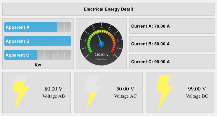
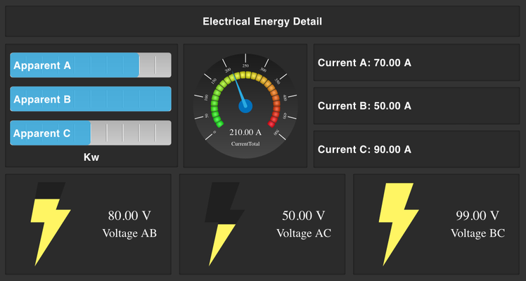
Works in light theme and dark theme
How To Use
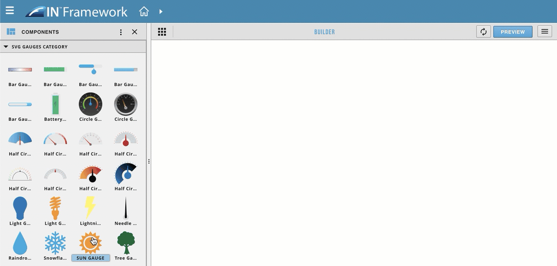
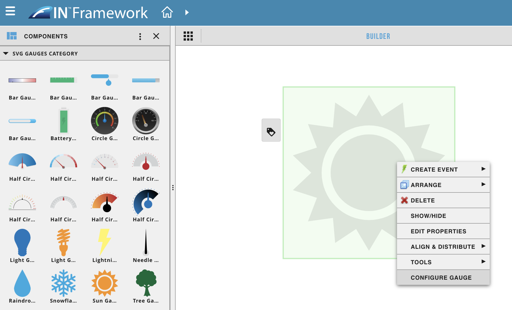
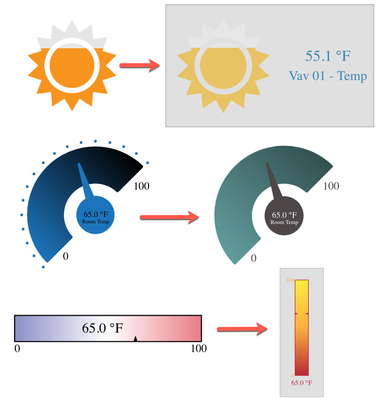
- Drag out an svg gauge from the svg gauges category
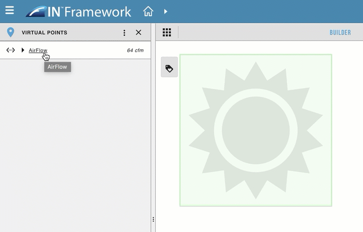
- Drag and drop a virtual point on top of the svg gauge
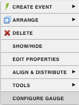
- Right click on the svg gauge
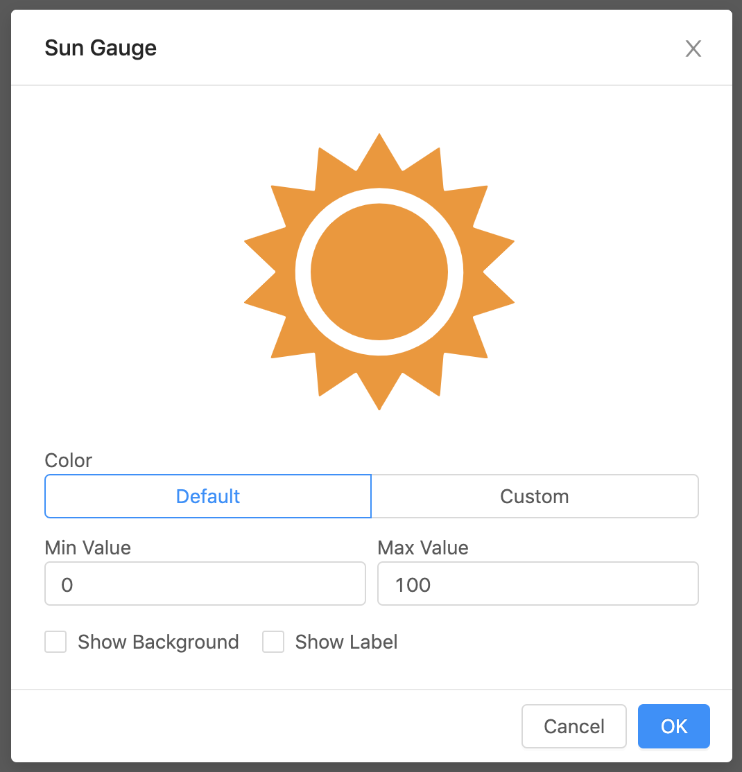
- configure gauge
- This will open up a form to customize the gauge
Note
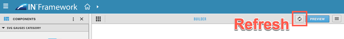
A refresh is sometimes necessary for the changes to take place
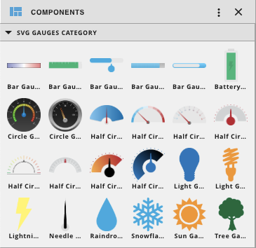
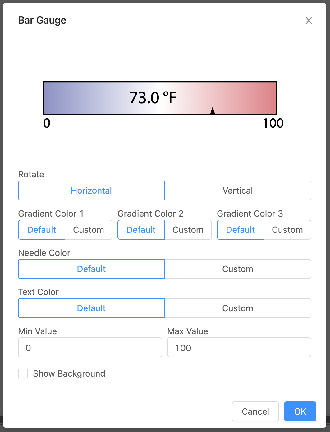
Bar Gauges
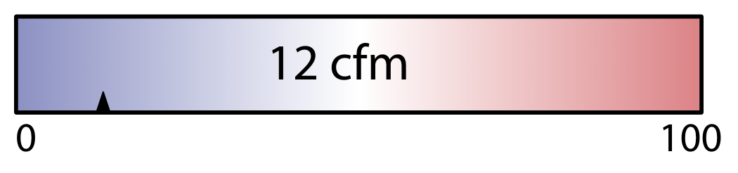
Bar Gauge 1
| Property | Value |
|---|---|
| Rotate | horizontal or vertical bar |
| Needle Color | Color of the border around the gauge (default #000) |
| Text Color | Color of the value |
| Gradient Color 1 | Gradient color on the left (top for vertical) (default #8B90C7) |
| Gradient Color 2 | Gradient color in the middle (default #FFF) |
| Gradient Color 3 | Gradient color on the right (bottom for vertical) (default #E97D84) |
| Min Value | Lowest value displayed on the gauge (default is the minVal on the virtual point if one exists, otherwise the default is 0) |
| Max Value | Highest value displayed on the gauge (default is the maxVal on the virtual point if one exists, otherwise the default is 100) |
| Show Background | Checkbox, if selected will show a view-container around the gauge |
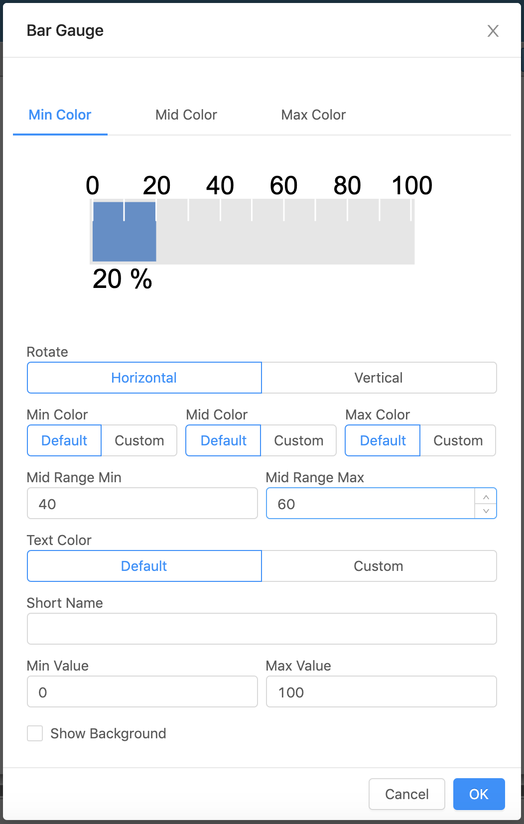
Bar Gauge 2
| Property | Value |
|---|---|
| Rotate | horizontal or vertical bar |
Min Value | Lowest value displayed on the gauge (default is the minVal on the virtual point if one exists, otherwise the default is 0) |
| Max Value | Highest value displayed on the gauge (default is the maxVal on the virtual point if one exists, otherwise the default is 100) |
| Text Color | Color of the text |
| Min Color | Color of the bar when below the set Mid Range |
| Mid Color | Color of the bar when in-between the set Mid Range |
| Max Color | Color of the bar when above the set Mid Range |
| Mid Range Min | Range in which the bar changes colors within (lower number) |
| Mid Range Max | Range in which the bar changes colors within (higher number) |
| Show Background | Checkbox, if selected will show a view-container around the gauge |
| Short Name | Name appearing with the gauge (if blank will show navName of the virtual point) |
Bar Gauge 3
| Property | Value |
|---|---|
| Rotate | horizontal or vertical bar |
| Short Name | Name appearing with the gauge (if blank will show navName of the virtual point) |
| Number Color | Color of the value |
| Text Color | Color of the navName/ Short Name |
| Color | Color of the bar and circle |
| Min Value | Lowest value displayed on the gauge (default is the minVal on the virtual point if one exists, otherwise the default is 0) |
| Max Value | Highest value displayed on the gauge (default is the maxVal on the virtual point if one exists, otherwise the default is 100) |
| Show Background | Checkbox, if selected will show a view-container around the gauge |
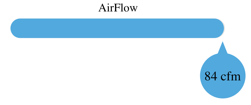
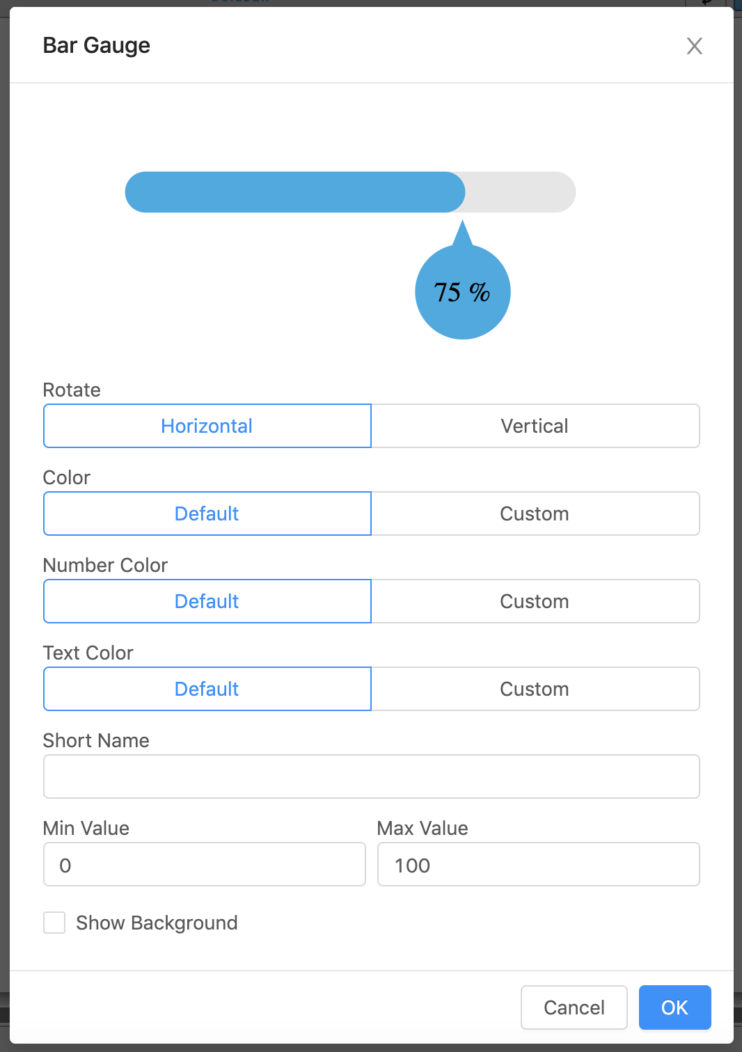
Bar Gauge 4
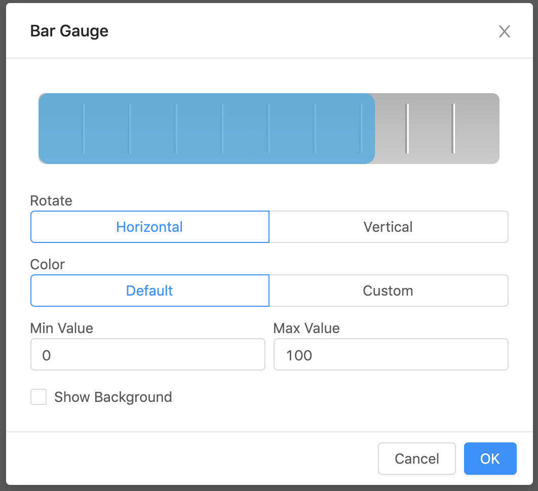
| Property | Value |
|---|---|
| Rotate | horizontal or vertical bar |
| Color | Color for gauge (default #29ABE2) |
| Min Value | Lowest value displayed on the gauge (default is the minVal on the virtual point if one exists, otherwise the default is 0) |
| Max Value | Highest value displayed on the gauge (default is the maxVal on the virtual point if one exists, otherwise the default is 100) |
| Show Background | Checkbox, if selected will show a view-container around the gauge |
Bar Gauge 5
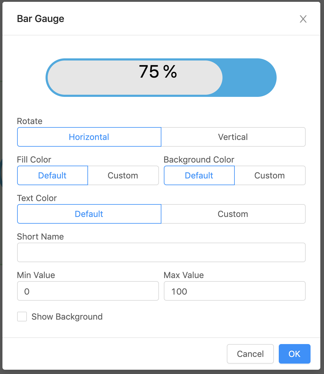
| Property | Value |
|---|---|
| Rotate | horizontal or vertical bar |
| Short Name | Name appearing with the gauge (if blank will show navName of the virtual point) |
| Text Color | Color for the text (default #000) |
| Background Color | Color of the whole gauge (default #29abe2) |
| Fill Color | Color for gauge fill (default #e6e6e6) |
| Min Value | Lowest value displayed on the gauge (default is the minVal on the virtual point if one exists, otherwise the default is 0) |
| Max Value | Highest value displayed on the gauge (default is the maxVal on the virtual point if one exists, otherwise the default is 100) |
| Show Background | Checkbox, if selected will show a view-container around the gauge |
Circle Gauges
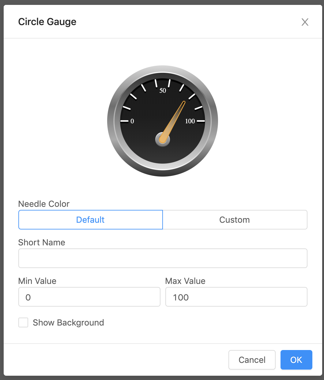
Circle Gauge 1
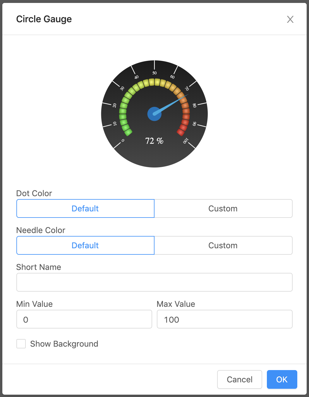
| Property | Value |
|---|---|
| Short Name | Name appearing with the gauge (if blank will show navName of the virtual point) |
| Needle Color | Color of the needle |
| Dot Color | Color of the dot behind the needle |
| Min Value | Lowest value displayed on the gauge (default is the minVal on the virtual point if one exists, otherwise the default is 0) |
| Max Value | Highest value displayed on the gauge (default is the maxVal on the virtual point if one exists, otherwise the default is 100) |
| Show Background | Checkbox, if selected will show a view-container around the gauge |
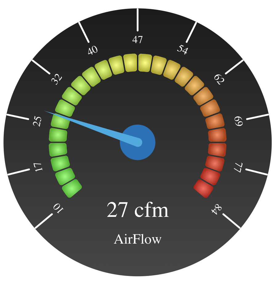
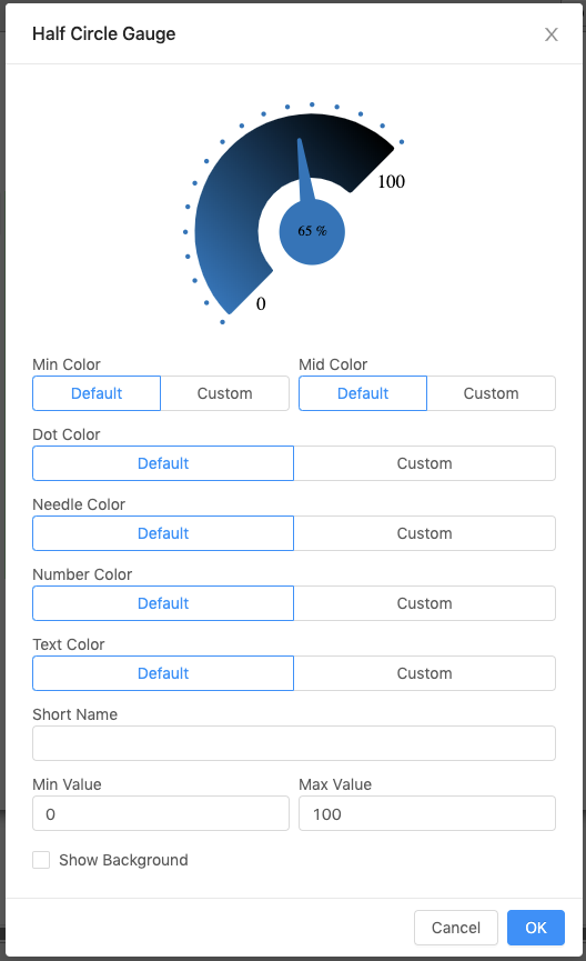
Circle Gauge 2
| Property | Value |
|---|---|
| Short Name | Name appearing with the gauge (if blank will show navName of the virtual point) |
| Needle Color | Color of the needle (behind the gradient) |
| Min Value | Lowest value displayed on the gauge (default is the minVal on the virtual point if one exists, otherwise the default is 0) |
| Max Value | Highest value displayed on the gauge (default is the maxVal on the virtual point if one exists, otherwise the default is 100) |
| Show Background | Checkbox, if selected will show a view-container around the gauge |
Half Circle Gauges
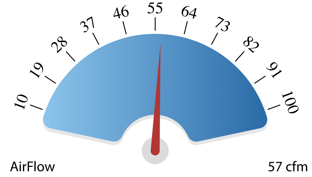
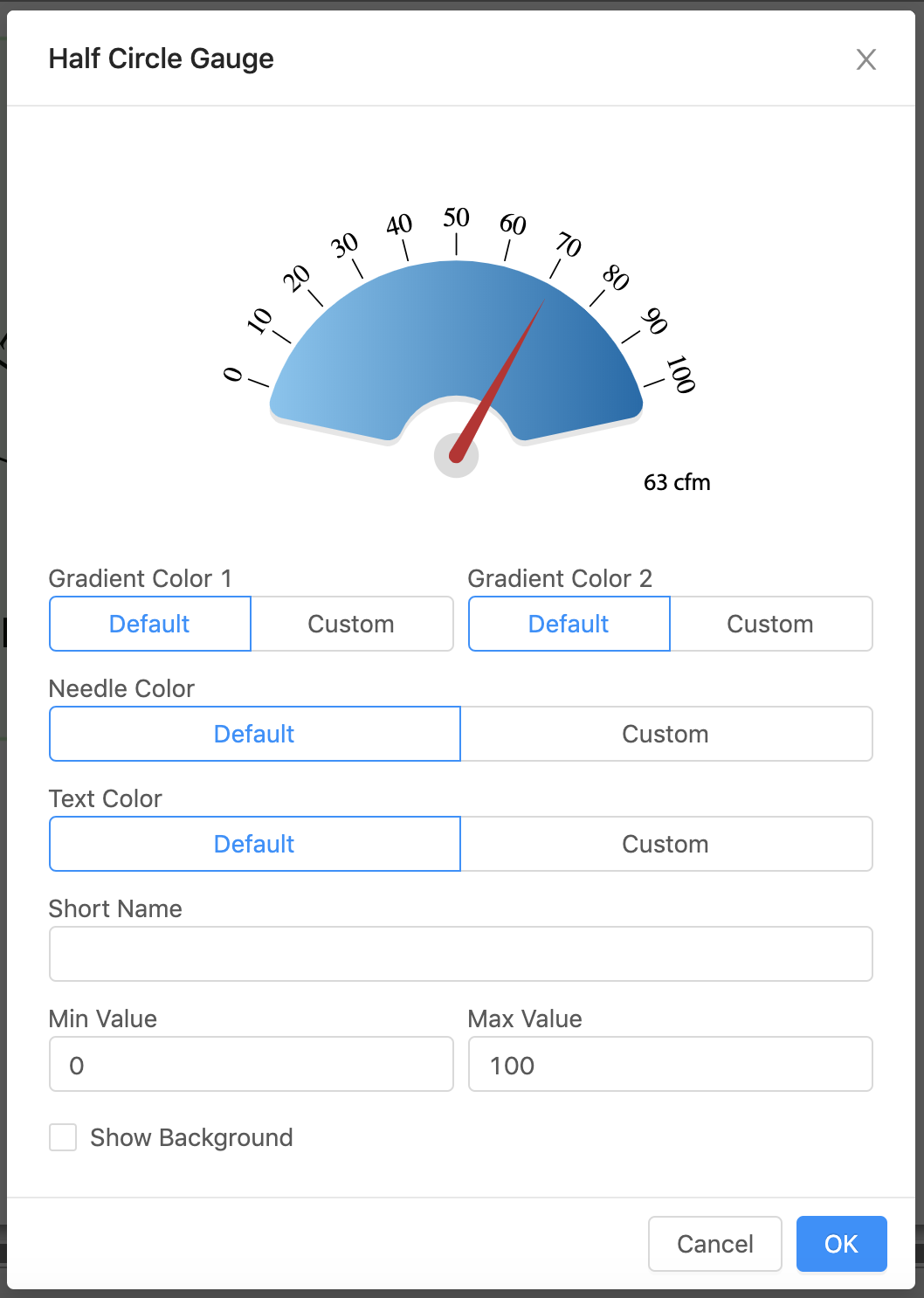
Half Circle Gauge 1
| Property | Value |
|---|---|
| Short Name | Name appearing with the gauge (if blank will show navName of the virtual point) |
| Text Color | Color of the text |
| Needle Color | Color of the needle |
| Gradient Color 1 | hex color of the left side gradient (default #7dc5f0) |
| Gradient Color 2 | hex color of the right side gradient (default #006bac) |
| Min Value | Lowest value displayed on the gauge (default is the minVal on the virtual point if one exists, otherwise the default is 0) |
| Max Value | Highest value displayed on the gauge (default is the maxVal on the virtual point if one exists, otherwise the default is 100) |
| Show Background | Checkbox, if selected will show a view-container around the gauge |
Half Circle Gauge 2
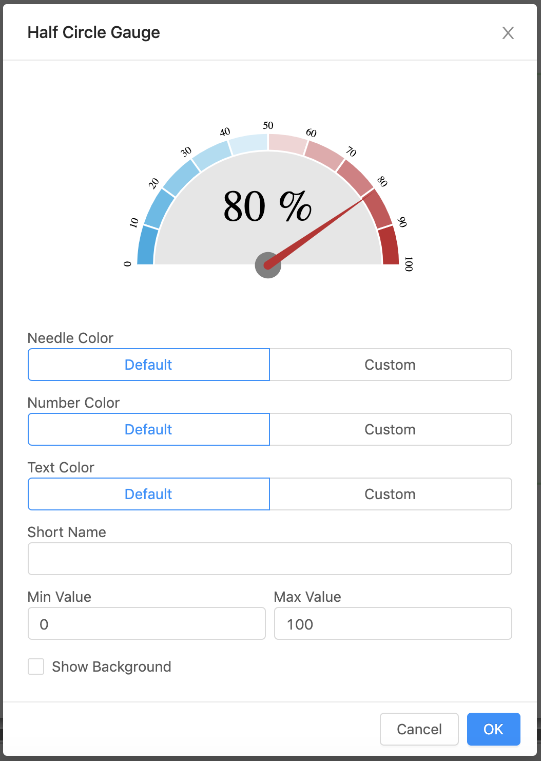
| Property | Value |
|---|---|
| Short Name | Name appearing with the gauge (if blank will show navName of the virtual point) |
| Text Color | Color of the main value |
| Number Color | Color of the numbers |
| Needle Color | Color of the needle |
| Min Value | Lowest value displayed on the gauge (default is the minVal on the virtual point if one exists, otherwise the default is 0) |
| Max Value | Highest value displayed on the gauge (default is the maxVal on the virtual point if one exists, otherwise the default is 100) |
| Show Background | Checkbox, if selected will show a view-container around the gauge |
Half Circle Gauge 3
| Property | Value |
|---|---|
| Short Name | Name appearing with the gauge (if blank will show navName of the virtual point) |
| Text Color | Color of the text displaying the value |
| Needle Color | Color of the needle |
| Min Value | Lowest value displayed on the gauge (default is the minVal on the virtual point if one exists, otherwise the default is 0) |
| Max Value | Highest value displayed on the gauge (default is the maxVal on the virtual point if one exists, otherwise the default is 100) |
| Show Background | Checkbox, if selected will show a view-container around the gauge |
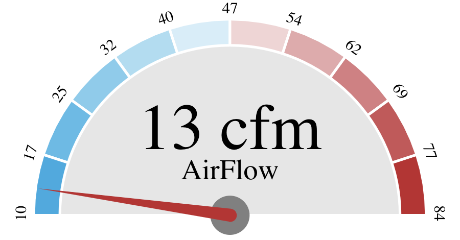
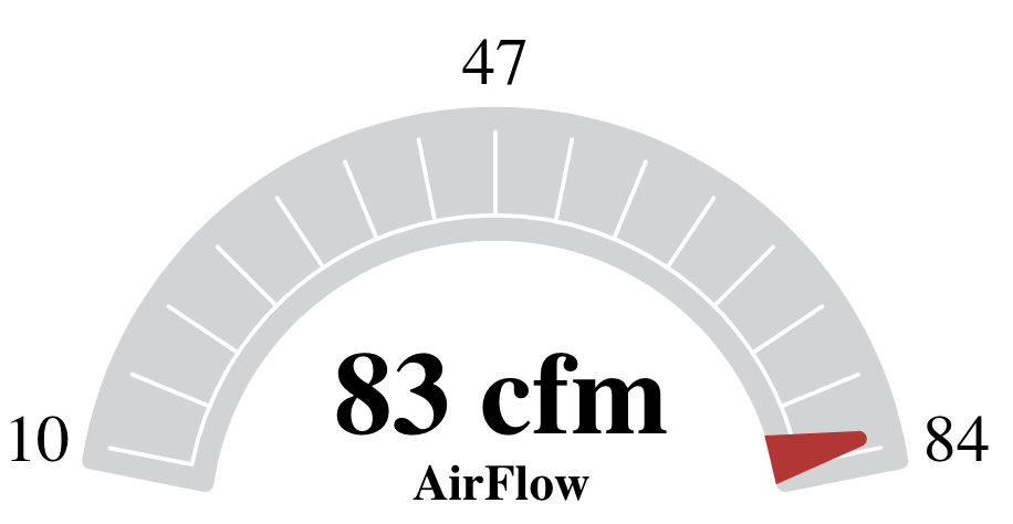
Half Circle Gauge 4
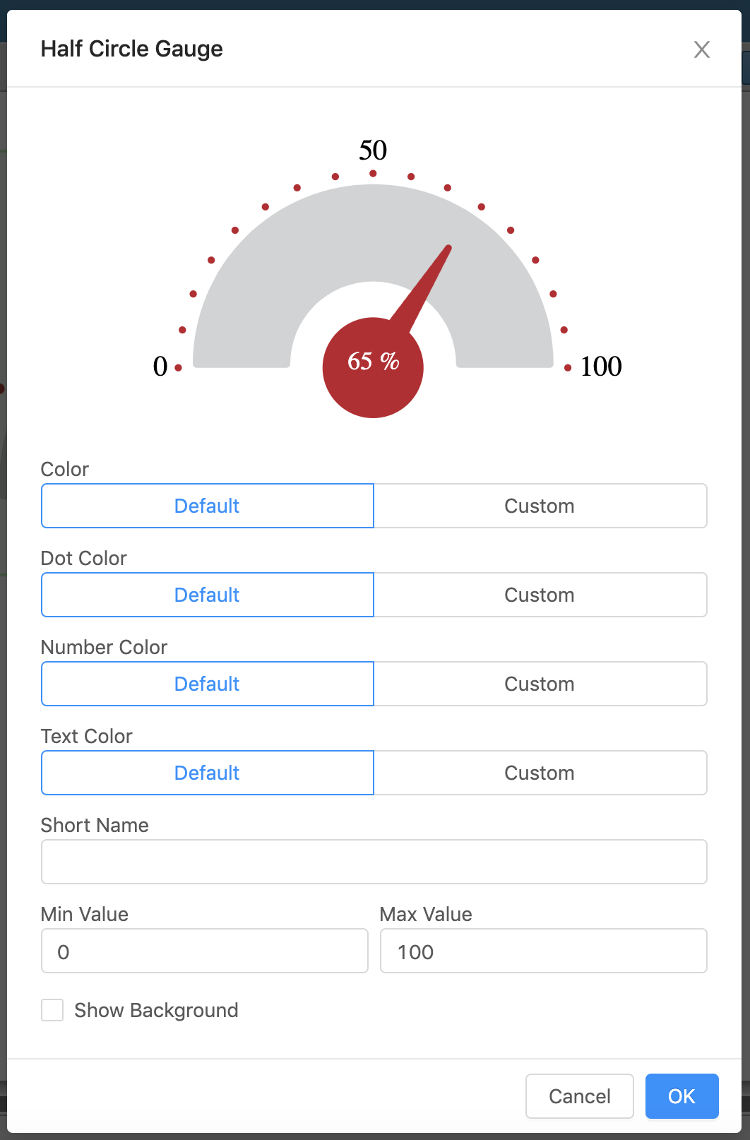
| Property | Value |
|---|---|
| Short Name | Name appearing with the gauge (if blank will show navName of the virtual point) |
| Text Color | Color of the value inside the dot |
| Number Color | Color of the numbers |
| Color | Color for the gauge (default #d1d3d4) |
| Dot Color | Color for the dots (default #be1e2d) |
| Min Value | Lowest value displayed on the gauge (default is the minVal on the virtual point if one exists, otherwise the default is 0) |
| Max Value | Highest value displayed on the gauge (default is the maxVal on the virtual point if one exists, otherwise the default is 100) |
| Show Background | Checkbox, if selected will show a view-container around the gauge |
Half Circle Gauge 5
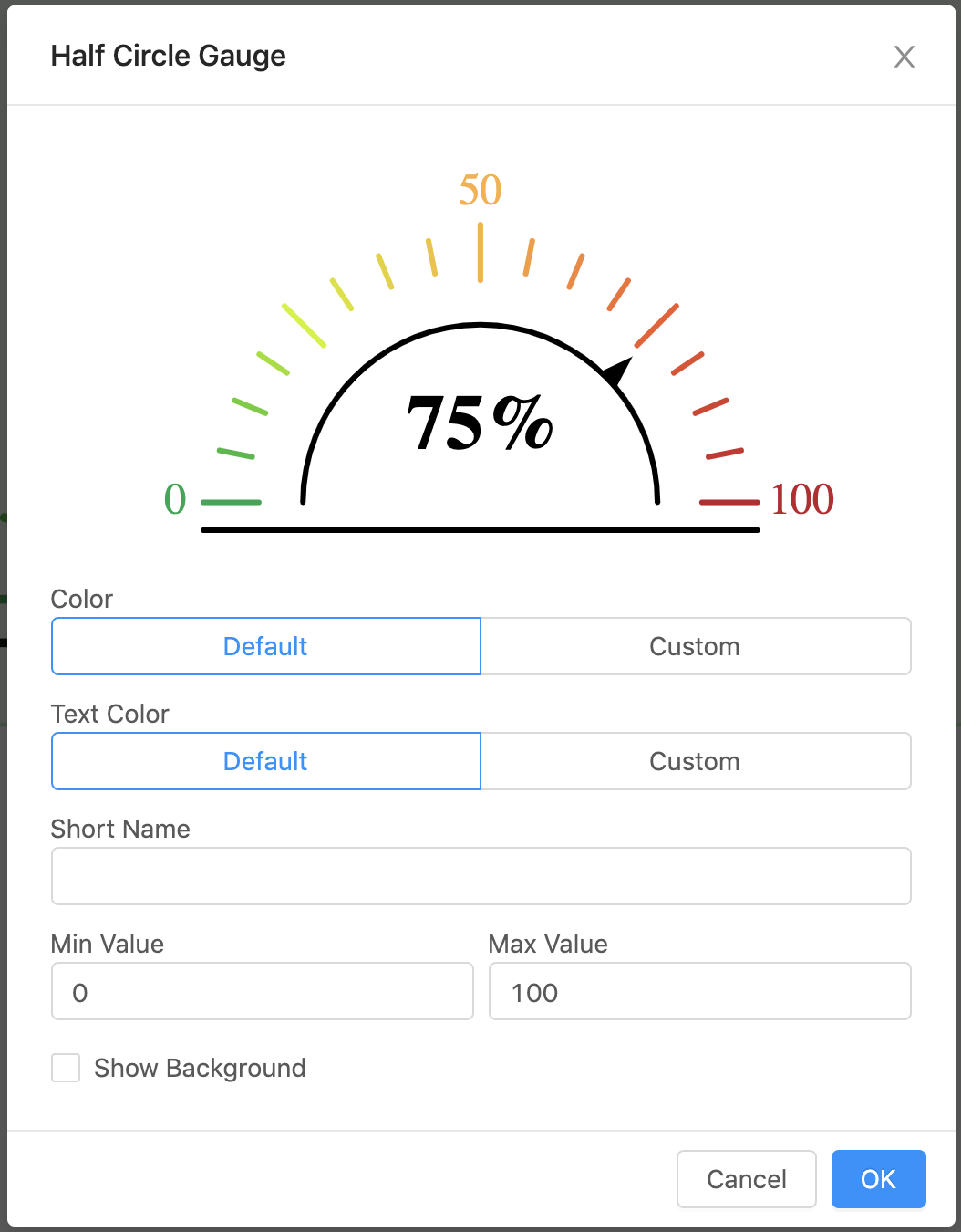
| Property | Value |
|---|---|
| Short Name | Name appearing with the gauge (if blank will show navName of the virtual point) |
| Color | Color of the horizontal line, semi-circle, and needle |
| Text Color | Color of the text inside the semi-circle |
| Min Value | Lowest value displayed on the gauge (default is the minVal on the virtual point if one exists, otherwise the default is 0) |
| Max Value | Highest value displayed on the gauge (default is the maxVal on the virtual point if one exists, otherwise the default is 100) |
| Show Background | Checkbox, if selected will show a view-container around the gauge |
Half Circle Gauge 6
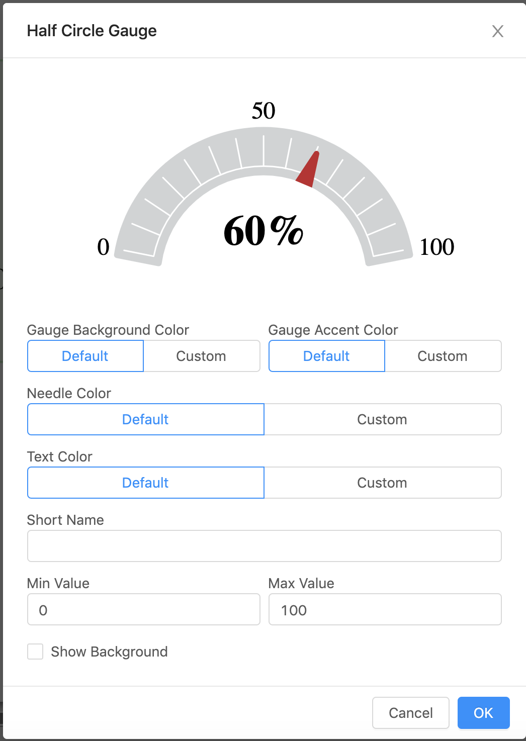
| Property | Value |
|---|---|
| Short Name | Name appearing with the gauge (if blank will show navName of the virtual point) |
| Gauge Background Color | Color of the gauge |
| Needle Color | Color of the needle |
| Gauge Accent Color | Color of the tic marks inside the gauge |
| Text Color | Color of the navName/Short Name and curVal |
| Min Value | Lowest value displayed on the gauge (default is the minVal on the virtual point if one exists, otherwise the default is 0) |
| Max Value | Highest value displayed on the gauge (default is the maxVal on the virtual point if one exists, otherwise the default is 100) |
| Show Background | Checkbox, if selected will show a view-container around the gauge |
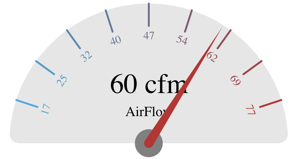
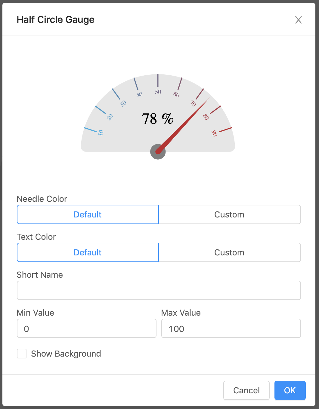
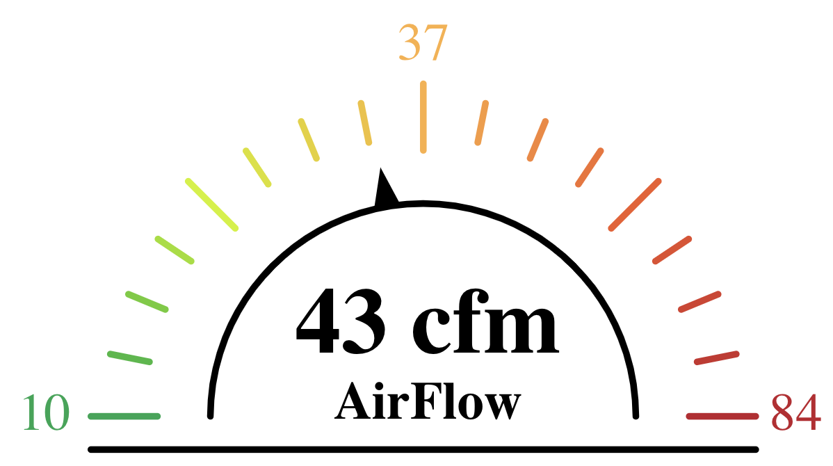
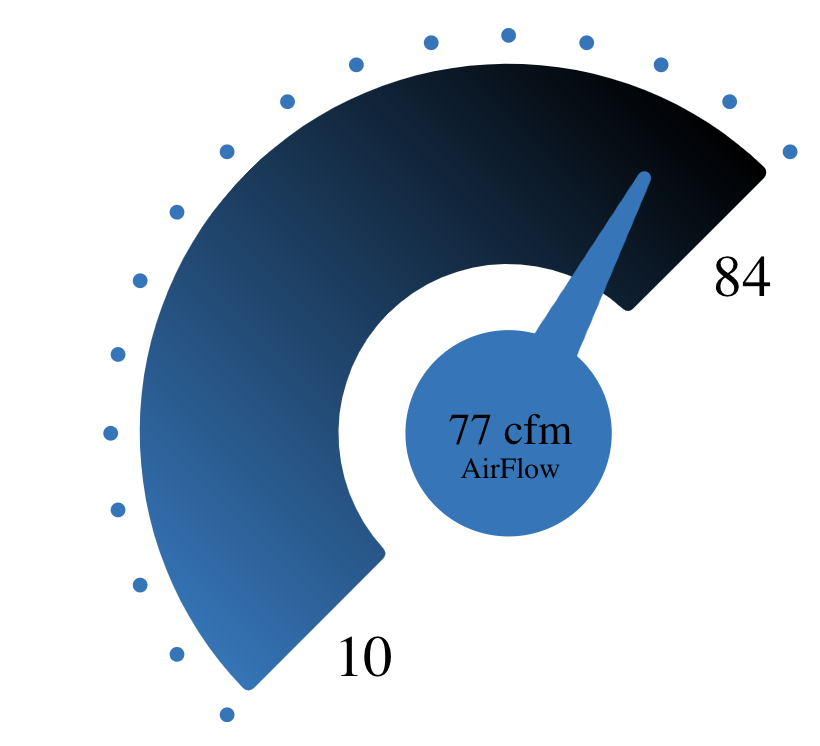
Half Circle Gauge 7

| Property | Value |
|---|---|
| Short Name | Name appearing with the gauge (if blank will show navName of the virtual point) |
| Dot Color | Color for the dots (default #ba2835) |
| Number Color | Color of the Min Value and Max Value |
| Gradient Color 1 | Color of the left side gradient (default #fbb040) |
| Gradient Color 2 | Color of the left side gradient (default #be1e2d) |
| Needle Color | Color for the needle (default #000) |
| Text Color | Color of the curVal inside the needle |
| Min Value | Lowest value displayed on the gauge (default is the minVal on the virtual point if one exists, otherwise the default is 0) |
| Max Value | Highest value displayed on the gauge (default is the maxVal on the virtual point if one exists, otherwise the default is 100) |
| Show Background | Checkbox, if selected will show a view-container around the gauge |
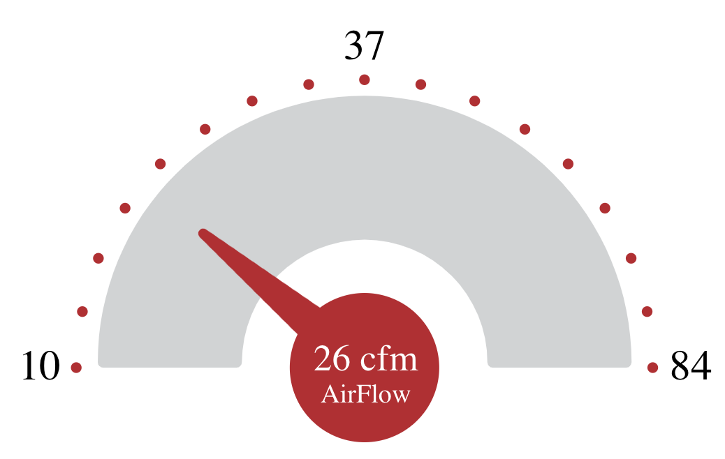
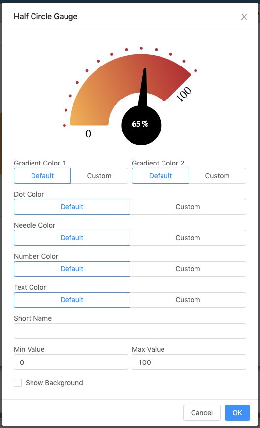
Half Circle Gauge 8
| Property | Value |
|---|---|
| Short Name | Name appearing with the gauge (if blank will show navName of the virtual point) |
| Gradient Color 1 | Color of the left side gradient (default #1b75bc) |
| Gradient Color 2 | Color of the right side gradient (default #000) |
| Number Color | Color of the Min Value and Max Value |
| Text Color | Color of the curVal inside the needle |
| Dot Color | Color for the dots (default #1b75bc) |
| Needle Color | Color for the needle (default #1b75bc) |
| Min Value | Lowest value displayed on the gauge (default is the minVal on the virtual point if one exists, otherwise the default is 0) |
| Max Value | Highest value displayed on the gauge (default is the maxVal on the virtual point if one exists, otherwise the default is 100) |
| Show Background | Checkbox, if selected will show a view-container around the gauge |
Icon Gauges
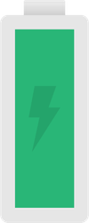
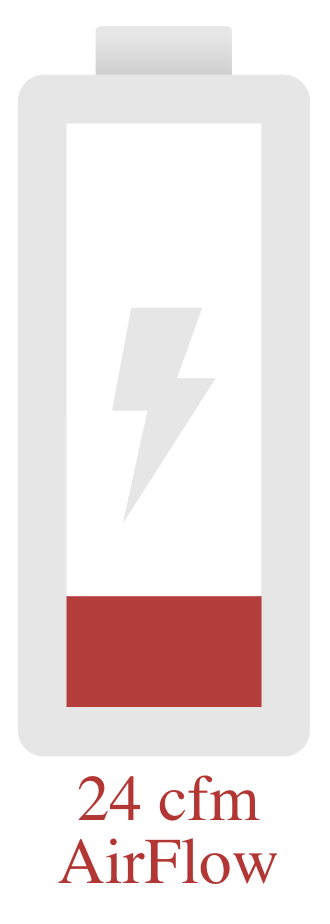
Battery Gauge
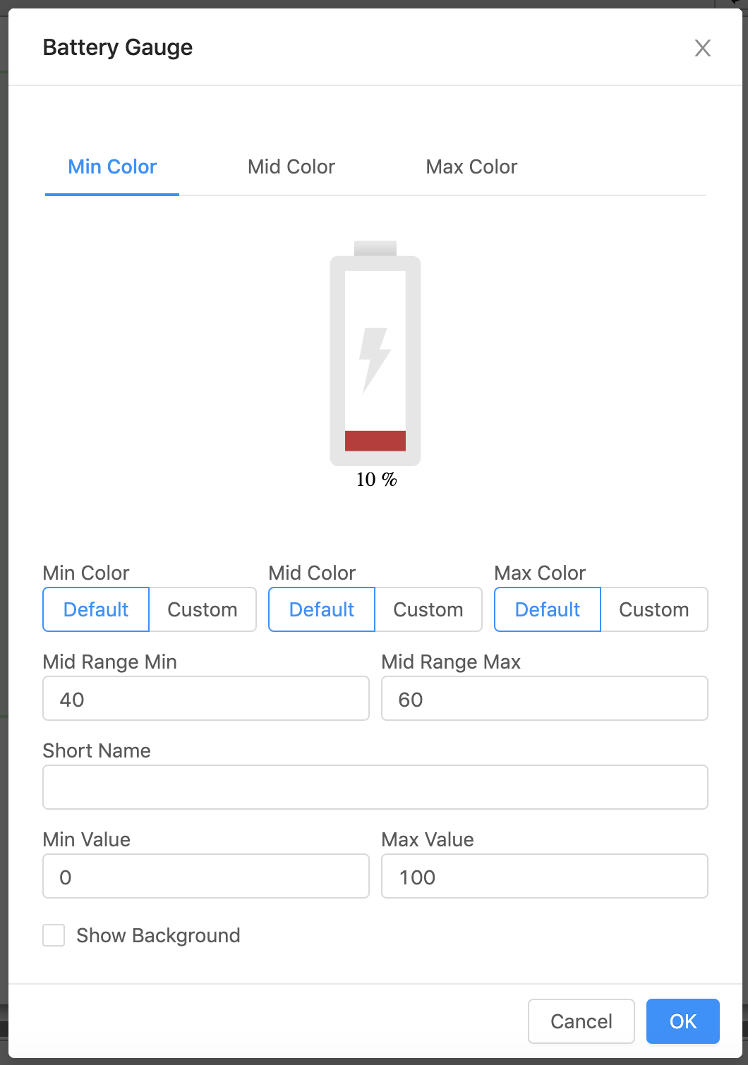
| Property | Value |
|---|---|
| Short Name | Name appearing with the gauge (if blank will show navName of the virtual point) |
| Min Value | Lowest value displayed on the gauge (default is the minVal on the virtual point if one exists, otherwise the default is 0) |
| Max Value | Highest value displayed on the gauge (default is the maxVal on the virtual point if one exists, otherwise the default is 100) |
| Low Range Color | Color of the bar when below the set Mid Range (default #d40000) |
| Mid Range Color | Color of the bar when in-between the set Mid Range (default #e79621) |
| High Range Color | Color of the bar when above the set Mid Range (default #5cb85c) |
| Mid Range Min | Range in which the bar changes colors within (smaller number) |
| Mid Range Max | Range in which the bar changes colors within (larger number) |
| Show Background | Checkbox, if selected will show a view-container around the gauge |
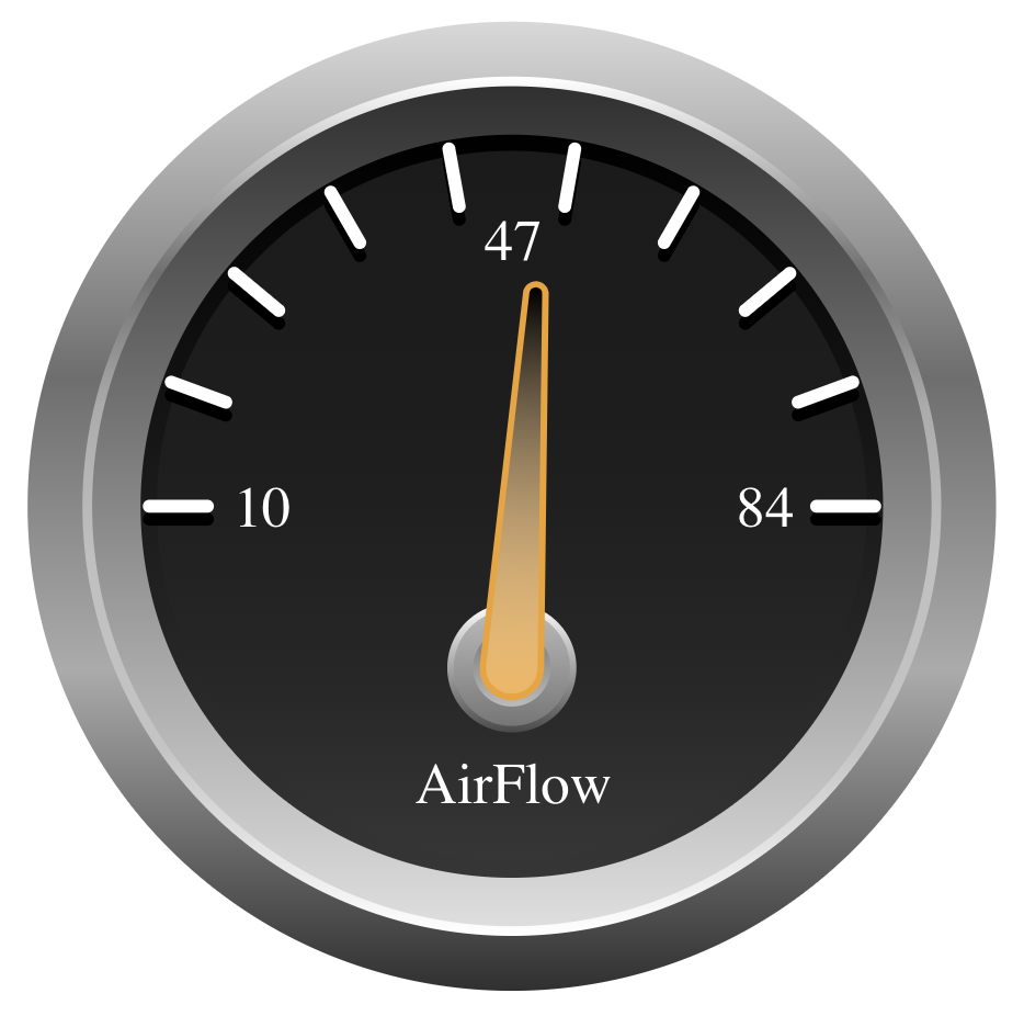
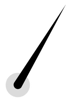
Needle Gauge
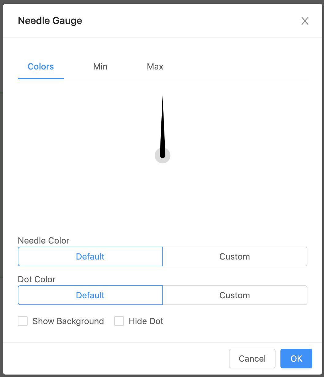
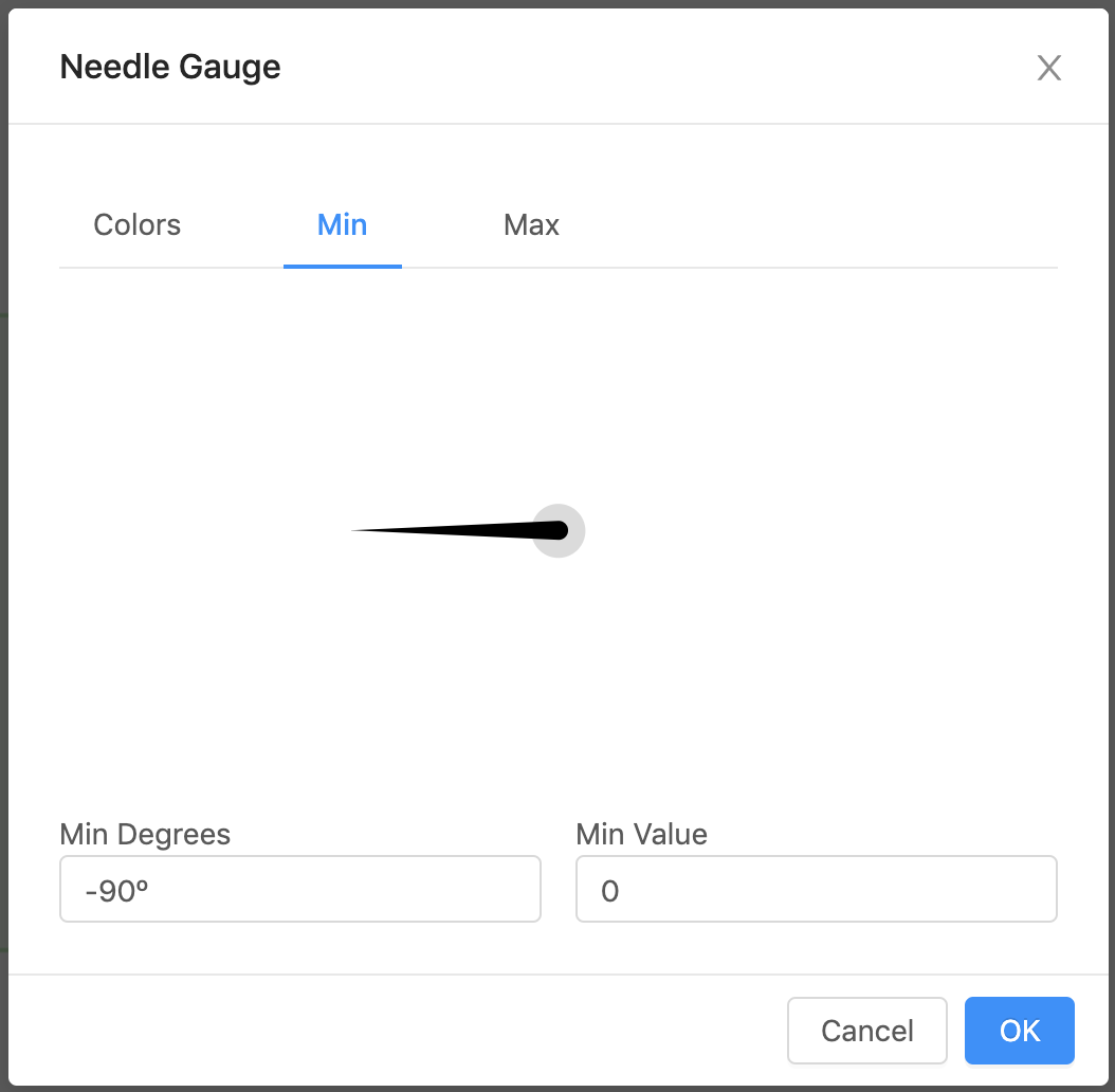
| Property | Value |
|---|---|
| Needle Color | Color for the needle |
| Dot Color | Color for the dot |
| Min Degrees | Lowest value degree (default -90) |
| Min Value | Lowest value displayed on the gauge (default is the minVal on the virtual point if one exists, otherwise the default is 0) |
| Max Degree | Highest value degree (default 90) |
| Max Value | Highest value displayed on the gauge (default is the maxVal on the virtual point if one exists, otherwise the default is 100) |
| Show Background | Checkbox, if selected will show a view-container around the gauge |
| Hide Dot | Will set the dot opacity to be transparent |
All Other Icon Gauges


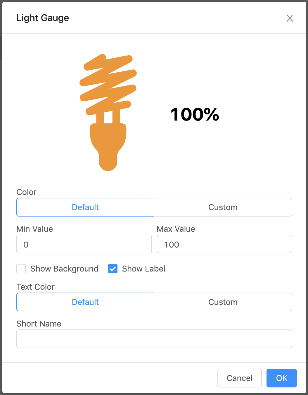
| Property | Value |
|---|---|
| Text Color | Color of text (Only visible when Show Label is checked) |
| Color | Color of the icon fill |
| Short Name | Name appearing with the gauge (if blank will show navName of the virtual point) |
| Min Value | Lowest value displayed on the gauge (default is the minVal on the virtual point if one exists, otherwise the default is 0) |
| Max Value | Highest value displayed on the gauge (default is the maxVal on the virtual point if one exists, otherwise the default is 100) |
| Show Background | Checkbox, if selected will show a view-container around the gauge |
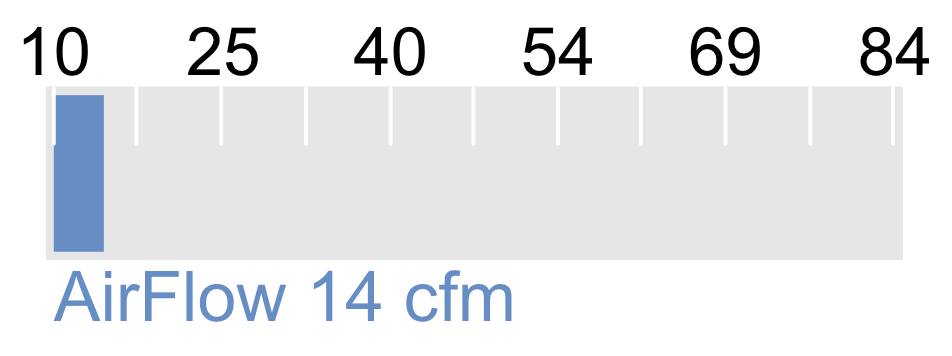
| Show Label | Displays the name and value next to the gauge |