Am Charts
- Jason Briggs (Unlicensed)
- Ricky Villa
- Christopher Simonian
Owned by Jason Briggs (Unlicensed)
Last updated: Jun 25, 2020 by Ricky Villa
Code
Date Range am Chart
Below is an example of how a user can create a chart with multiple predefault filters. In this example, we'll create two buttons to switch between. One for today rollup up by 1 hr with avg. The other for this week rollup 1 day with avg. You can choose your own preferred tags, just make sure to replace them in the corresponding areas we are using them in. We'll also explain how the $1, $2 etc work. They aren't required, but it can be useful depending on what you are trying to do.
- Tag the amChart component as "foo"
- Drag out two buttons and on them add the following string tags and one marker tag:
- dateRange - set value as "today" for one button and the other as "thisWeek". This is the filter for the hisRead where is it has $2. Its defined in the program as "this.dateRange".
- math - set value as "avg" on both buttons. This is the filter for the first parameter in hisRollup where it has $3. Its defined in the program as "this.math".
- interval - set value as "1hr" for the today button and "1day" for the other. This is a filter for the second parameter in the hisRollup where it has $4. Its defined in the program as "this.interval".
- chartButton - this is just a marker tag on which the program will run on as well.
- Create a program and make it run on "world or chartButton" with TO BE CONTINUED.
var myChart     = query('foo');
var myTarget    = query('targetPoint');
var myQuery     = sprintf('read(point and temp and sensor and equipRef==$1).hisRead($2).hisRollup($3, $4)',myTarget.pointId,this.dateRange,this.math,this.interval);
var promise = finstack.eval(myQuery);
promise.then(function(event)
{
    var jason = event.result.toObj();

    var chart = AmCharts.makeChart( myChart.view, {
      "type": "serial",
      "theme": "light",
      "dataProvider": jason,
      "gridAboveGraphs": true,
      "startDuration": 1,
      "graphs": [ {
        "balloonText": "[[category]]: <b>[[value]]</b>",
        "fillAlphas": 0.8,
        "lineAlpha": 0.2,
        "type": "column",
        "valueField": "v0"
      } ],
      "chartCursor": {
        "categoryBalloonEnabled": false,
        "cursorAlpha": 0,
        "zoomable": false
      },
      "categoryField": "ts",
      "categoryAxis": {
        "gridPosition": "start",
        "gridAlpha": 0,
        "tickPosition": "start",
        "tickLength": 20,
        "labelsEnabled": false
      },
      "export": {
        "enabled": true
      }

    });
});
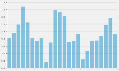
End result with both today and thisWeek results in that order.
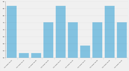
Sample Bar Chart with Columns clicking on columns and getting Magic Bubbles.
var myPoint = query('virtualPoint and query');
var myChart = query('foo');

function magicBubbles(ev){
    var myPointId = ev.item.dataContext.id;
    top.app.ShowRelatedBubbles(myPointId,myPointId,false,context.event);
    // console.log(ev)
}

var chart = AmCharts.makeChart( myChart.view, {
  "type": "serial",
  "theme": "light",
  "dataProvider": myPoint.curVal.toObj(),
  "gridAboveGraphs": true,
  "startDuration": 1,
  "graphs": [ {
    "balloonText": "[[dis]]: <b>[[area]]</b>",
    "fillAlphas": 0.8,
    "lineAlpha": 0.2,
    "type": "column",
    "valueField": "area"
  } ],
  "chartCursor": {
    "categoryBalloonEnabled": false,
    "cursorAlpha": 0,
    "zoomable": false
  },
  "categoryField": "dis",
  "categoryAxis": {
    "gridPosition": "start",
    "gridAlpha": 0,
    "tickPosition": "start",
    "tickLength": 20
  },
  "export": {
    "enabled": true
  },
  "listeners": [ {
    "event": "clickGraphItem",
    "method": magicBubbles
}]

} );
Pie Chart with Slices clickable to Magic Bubbles
var myChart = query('foo');
var myQuery = query('virtualPoint and query');
function handleZoom(ev){
    var myPointId = ev.dataItem.dataContext.id;
    top.app.ShowRelatedBubbles(myPointId,myPointId,false);
}
var chart = AmCharts.makeChart( myChart.view, {
  "type": "pie",
  "theme": "light",
  "dataProvider": myQuery.curVal.toObj(),
  "valueField": "area",
  "titleField": "dis",
   "balloon":{
   "fixedPosition":true
  },
  "export": {
    "enabled": true
  },
  "listeners": [ {
      "event": "clickSlice",
      "method": handleZoom
   }]
} );
Downloads
Custom Chart w/ Magic Bubbles
Download: customChartA.zip
- Go to folio view in the smart menu and select "restore"
- Download the customChartA.zip and drag it into the restore window
- Now you will have the customChartA saved as a model, which will be accessible in your graphic component library
- All you need to do to make the chart work is create a virtualPoint query and the chart will automatically load up the curVals of each result into a bar.
, multiple selections available,