Animation Editor
- Ricky Villa
- Christopher Simonian
Animation Editor
The Animation Editor feature allows the user to create their own animation components using their own image frames. This works for any type of points. Once created, the user would treat them like any of the built in components. The user would just bind a point and it should animate automatically or create a program to control them. If creating a custom program to control them, be sure to remove the basicBinding, ductComponent, and ductProgram tags so that they don't conflict with your program when controlling them.
GIFs
This does not work with GIFs. GIFs are a different type of image and they cannot be controlled. What we recommend is to find a website online that can split the GIF into images, that you can then use with the Animation Editor. Here is an example website that can split the GIFs: https://ezgif.com/split.
Before Using Animation Editor
First the user will want to make sure their images exist in FIN Stack database files so that they can be able to select them through the Animation Editor. We recommend to name the images properly so that the user can know which ones they are when choosing through the tool.
The user can upload the images two different ways.
- They can select all images from their desktop or wherever they are located and drag/drop on the Graphics Builder world. Once dropped, they automatically get added to the Files system. Now the user can delete the images dropped in the world since we won't be needing them there anymore.
- Another way is to go to Legacy folio > Files > and upload each one there directly.
Thats it, once they exist in the Files system, we'll be able to access them through the tool to use in the Graphic Builder app.
Using Animation Editor
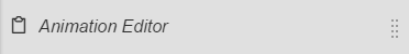
The Animation Editor can be found in the Graphics Builder right menu. The user would first navigate to the equipment and open the graphic they would like to modify to add an animation component.
Once the graphics builder is open, the user will click on the "hamburger/settings" icon on the right of the preview button. That would open the right menu in Graphics Builder.
The user would then scroll all the way down to find the Animation Editor as the last option.
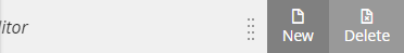
Below are the options once selected:
- New - Create a new animation component
- Delete - Delete an existing animation component
We'll be explaining each option in more detail below.
New
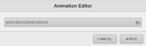
The user would select this option if they are looking to create a new animation component. Once selected, they will be prompted with the below pop up.
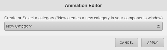
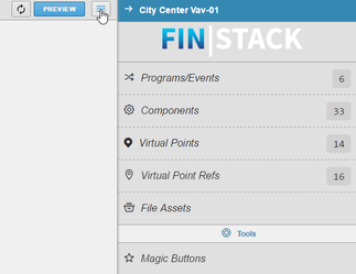
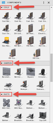
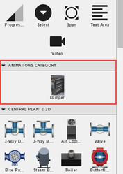
From here the user, can select to choose which custom category they would like to apply the component too. Category meaning section within the components panel like below. Coils, Dampers, and Ducts are each categories in the Components panel. This allows the user to be able to organize their custom components. Note: The user is creating their own custom category, not choosing/applying to a built in category.
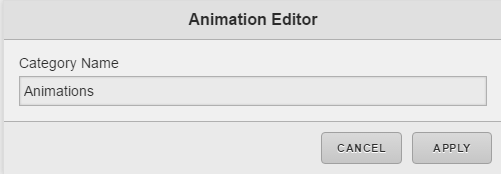
Once the user selects to create a new category they will be prompted with the below pop up to choose a name. Else if selecting existing category, it'll skip to the next step for component name and animation type.
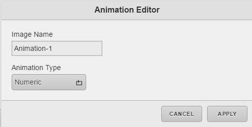
Then they will be prompted with the below pop up that allows them to choose a name for the component and image type.
The available types are:
- Numeric - These are components being controlled with a numeric point. An example would be a damper or coil component.
- Boolean - These are components being controlled with a boolean point. An example would be a light bulb, fan, pump etc.
- Enum/String - These are components being controlled with an enum or string point. An example would be a fan or pump.
Note: All types support single or multiple images. If single image is selected for a particular value, the no animation. If multiple images selected for a particular value, then they will loop (animate) evenly between all selected.
Once the user chooses a name and type for their animation component, the will be prompted with one of the below pop ups depending on animation type chosen. They will be able to select the images to use for the animation component.
Numeric Animation Type
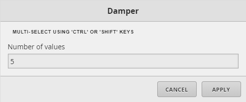
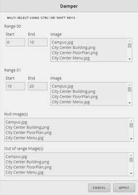
If numeric animation type was selected, then the user will get a pop up like below to choose how many values of frames they will be having.
Then they will be prompted with the below pop up where the user can specify the START and END of each range. Then pick a single or multiple images for each range. If multiple selected, images will loop when the value is in specified range. There are also a Null and Out of range options that the user can specify if the value falls within one of those parameters. They are optional.
Note: If the user wants to specify a whole number instead of a range, then they can enter the same number for the START and END slots.
Boolean Animation Type
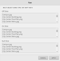
If boolean animation type was selected, then the user will get a pop up like below to choose a single or multiple images for Off and On states. Then there is an optional Null state that the user can specify as well.
Enum/String Animation Type
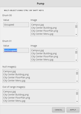
If enum/string animation type was selected, then the user will get a pop up like below to choose how many values of frames they will be having.

Then they will be prompted with the below pop up where they can enter the enum/string value states. The order doesn't matter as long as the value is correct. It is case sensitive. The user can choose a single or multiple images for each value. As well as the Null or Out of Range options that are optional.
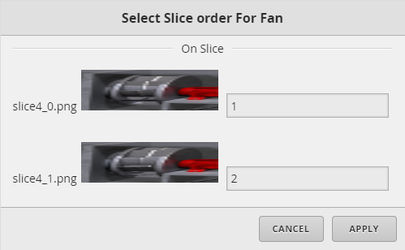
Multiple Images Selected
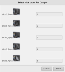
Once the user has chosen their images and has picked multiple for any state, they will then be prompted with the below pop up where they can choose in which order the images should loop.
Couple examples below.
Once the user is done, they would apply the changes. Thats it, the component now should appear at the top left of the world. The user can then move the new component and place it where they would like. Bind a point to it and done.
Refresh
If for some reason the component doesn't appear in the world. The user can save their graphic and then refresh the browser to see if the component appears. They can also look in the components panel for their new category they made and see if it exists there. They can then drag it out to use it.
Once created, the user can also find the new component in the Components panel under the category they chose. Below is an example we made. We called our category "Animations" and called the component "Damper". It now exisits in the components panel where it can be reused as needed.
Delete
If the user would like to delete an existing animation component, they can do so be selecting the "Delete" option. Once selected, they will be prompted with the below pop up to choose the category in which the animation component exists in.
Then once selecting a category, they will be prompted with the below pop up where they can choose the animation component they want to delete.
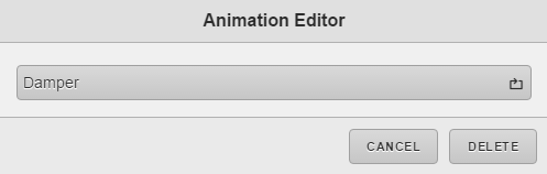
Once a component has been chosen to be removed, the user will select the Delete button which will prompt the below pop up.
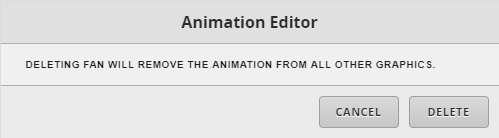
That will remove the component from any graphic where it is being used. This will help clean up the graphics and avoid leaving broken components in the graphics. The user will have to re-add any new animated components if needed.
Aside from that, thats it, the animation component would then be removed. The user can then refresh the browser if needed to see the change.